Premier League: from red success to grey failure – how kit colours appear to impact performance

Source: The Conversation – UK – By Zoe Wimshurst, Senior Lecturer of Sport Psychology, Health Sciences University

As the Premier League season kicks off, fans will debate their new kits almost as much as new signings. But could shirt colour actually give teams a performance edge? Science suggests they can.

One of the most studied colour effects in sport is that of red kits leading to greater success. In the Premier League era, more than half of all champions have worn red home kits, and a study looking at the 2004 Olympic Games found that in combat sports, where the colours of red and blue are randomly assigned, athletes wearing red were more likely to win.

These effects have also been shown in Rugby League and esports (video game competitions).

But why is this? It has been suggested that from both a cultural and biological perspective, red is associated with dominance and aggression. Wearing red has been shown to boost players feelings of dominance whereas an opponent who is wearing red is perceived as more threatening.

Research has also shown that taekwondo referees award more points to fighters in red than blue – even when digital manipulation allows them to view exactly the same fight with just the colours reversed. Studies on football players have also found that strikers score fewer goals when facing a goalkeeper wearing red.

There are other useful colours, too. The gold selected by Crystal Palace is a strong contender as it offers high visibility under both daylight and flood lights. Lighter colours which will offer a high contrast against the pitch, such as the whites chosen by Chelsea and Nottingham Forest, will also stand out.

Psychologists call these “colour singletons”, hues that are unique in the visual scene. Studies show that our attention is automatically drawn to them. Unusual colours that are unlikely to match those found on the pitch or advertising boarding will make players easier to detect at a glance.

Tottenham Hotspurs players of the 2016–17 season wearing white.
Tottenham spurs players of the 2016–17 season wearing white.
wikipedia, CC BY-SA

Patterns matter too. High-contrast blocking or stripes can help separate a moving object from its background. Bournemouth’s striped away kit should be more visible than a plain mid-tone shirt. The contrast between the luminous top half of Fulham’s away shirt and the relatively dark shorts should also enhance detection.

Camouflage effect

Despite this evidence, not a single Premier League club has chosen red for an away kit this season. Instead, there are some novel choices such as lilac, cream and turquoise. A previous example of a novel kit choice not working so well was in 1996 when Manchester United’s infamous grey away kit was scrapped mid-game after gong 3-0 down to Southampton.

The manager, Alex Ferguson, claimed players couldn’t see each other clearly. It wasn’t just an excuse, the grey was a near perfect match for the concrete of the stadium and blended into the blur of the crowd.

Camouflage effects like this are well documented in biology. Indeed, animals depend on them to make detection by predators harder. In a stadium, muted greys or browns can do the same. Brentford’s new brown away kit risks a similar problem, especially in overcast conditions or with concrete-backed stands. Black kits can also fade into the background, particularly in low light conditions where there is reduced contrast.

This season, Tottenham Hotspur*, Manchester City and Aston Villa have all selected black away shirts which could lead to lower visibility of teammates.

Camouflage is not limited to dull colours. Newcastle’s green away kit, while bright, is likely to merge with the turf, particularly in players peripheral awareness where the human visual system is not designed to see colours clearly.

Another subtle visual trap is “countershading”, a gradient that goes from dark to light found in many animals to make them less detectable. In football, a dark shirt with pale shorts could break up a players outline in bright sunlight. This is great for a deer-avoiding predators, less helpful if you are trying to spot your striker in space.

So why don’t clubs use this science to select kits? The answer is most likely commercial. Away kits are as much about selling shirts as improving performance. Novelty colours create buzz, drive sales and help clubs stand out on the high street, even if they blend in on the pitch.

Colour is not just fashion. It is also linked to psychology, perception and physics. The right shade can make you unmissable, the wrong one can make you disappear. In elite sport, with such fine margins between success and failure, kit colour is an area which should not be overlooked.

The Conversation

Zoe Wimshurst is the owner of Performance Vision Ltd, a company specialising in visual training and consultancy services.

ref. Premier League: from red success to grey failure – how kit colours appear to impact performance – https://theconversation.com/premier-league-from-red-success-to-grey-failure-how-kit-colours-appear-to-impact-performance-263062

How cutting waiting lists for mental healthcare would save money – and people’s jobs

Source: The Conversation – UK – By Roger Prudon, Lecturer in Economics, Lancaster University

There are more than 1 million people on NHS waiting lists for mental healthcare in the UK. Many of them have to wait weeks or months before treatment can begin for conditions such as depression and anxiety.

And according to recent figures from the BBC, there are 12 times more patients waiting longer than 18 months for mental health treatment compared to those with physical conditions.

My research suggests that being on these waiting lists can have a detrimental impact not just on a person’s mental health, but also on their employment prospects and financial security.

This is because every extra month that a patient has to wait for treatment significantly increases the total amount of care they will need. And it also increases the likelihood that they will end up losing their job because of their condition.

The majority of those who lose their job after languishing on a waiting list remain unemployed for years. Many never return to work.

Among those who become unemployed, I found that approximately half end up receiving disability benefits. The other half will rely on different kinds of state benefits such as income support or depend financially on family members.

So providing speedier access to mental healthcare could have a significant economic impact, personally, and for the state. In the Netherlands where I collected my data (it’s not openly available in the UK), I calculated that a one-month reduction in average waiting time would save that country more than €300 million (£261 milllion) each year in unemployment related costs, such as benefits payments and income taxes.

For the UK, with its larger population, this would translate into an annual saving of more than £1 billion.

Recruitment savings

My calculations also show that approximately 3,000 additional full-time psychiatrists and psychologists would be needed to reduce the NHS mental healthcare waiting list by one month. With annual salaries coming to less than £300 million, this would leave £700 million to spend on recruitment and training.

The NHS knows it needs to do something about these waiting lists. Health minister Stephen Kinnock has commented: “For far too long people have been let down by the mental health system and that has led to big backlogs.”

And there is a plan to hire more mental healthcare professionals and increase training opportunities, which could substantially shorten waiting times for mental healthcare in the long run.

Door open to waiting room.
Wait and see.
Nick Beer/Shutterstock

In May 2025, the government said it would be opening specialist mental health crisis centres. Starting off with six pilots centres throughout the UK, these are meant to alleviate pressure from A&E departments and treat individuals in acute mental distress.

But while ensuring timely access to care for those with the most severe and acute mental health problems, these plans are unlikely to reduce waiting times for those waiting for non-emergency pre-planned care. Total funding for the new crisis centres is budgeted at £26 million, thereby increasing the NHS mental healthcare budget of around £18 billion by less than 0.2%.

Concerns have also been raised by the Royal College of Psychiatrists, which has stated that the new plans are unlikely to benefit the majority of patients as many of them also suffer from physical health problems. These people require fully integrated services, rather than separate mental health crisis centres.

Reducing the waiting lists for mental healthcare will not be easy and will come at a considerable financial cost. But my study shows that an economic case can be made for the increased investment.

Shorter waiting lists will speed up care and help more people to remain in work. The potential benefits, in terms of both health and economics would be substantial, helping patients, the healthcare system and society as a whole.

The Conversation

Roger Prudon receives funding from the Dutch Research Council
(NWO).

ref. How cutting waiting lists for mental healthcare would save money – and people’s jobs – https://theconversation.com/how-cutting-waiting-lists-for-mental-healthcare-would-save-money-and-peoples-jobs-258352

How a new way of thinking about empathy could cool Britain’s migration rows

Source: The Conversation – UK – By Georgios Karyotis, Professor of Security Politics, University of Glasgow

Recent protests at asylum hotels in Epping, Essex, have prompted calls from the hotel’s residents for something rare in UK migration debates: understanding. This is something that has been clearly lacking in the conversations fuelling anti-immigrant protests, from Southport in summer 2024 to Ballymena in Northern Ireland and Essex this year.

Protesters denounce asylum seekers as “criminals”, while authorities dismiss protests as “mindless violence” and “thuggery”. These labels stick because neither side really understands the other.

Our recent study illustrates this, showing how far imagination outruns knowledge when it comes to migration. People tend to overestimate refugees’ negative feelings and underestimate their positive feelings.

We asked Britons what they thought Syrian refugees in the UK felt. But only 15% of Britons guessed that “hopeful” – not “afraid”, “desperate” or “angry” – was their most commonly reported emotion.

That mismatch between reality and perception is what researchers call an “empathy gap”: our inability to accurately recognise the emotions of people outside our own group. This gap is where fear and misinformation can take hold. But a new way of thinking about empathy could help close it.

The trouble with empathy

Empathy is often celebrated in liberal democracies as vital towards peaceful coexistence between groups, critical to democratic functioning and conflict resolution.

Evidence suggests that empathy can promote more inclusive behaviour toward refugees by making citizens more aware of refugees’ experiences. Similarly, training that emphasises the importance of empathy in police officers has been shown to reduce the risk of confrontation between protesters and officers.

Empathy research often asks people to imagine another’s feelings and then rate their own level of concern. However, self-reported empathy measures are prone to socially desirable responding and gender biases. They also assume we know what “others” feel without ever checking with them. This means that what we record as “empathy” may, in fact, be inaccurate guesswork – filtered through our own biases – rather than a genuine understanding of the other’s reality.

How can we be sure that the version of the world we see through another’s eyes is valid, if we haven’t asked the “other” in the first place how they see the world?

Instead, we propose the concept of “intersubjective empathy”. This approach is about accurately recognising how others feel, as reported by them. It is a cognitive ability, not a moral badge, necessitating that we first ask others what they feel, rather than assume it.

This boils the empathy exercise down to just two short questions: The out-group is asked: “How do you feel?” The in-group is asked separately: “How do you think the out-group feels?” Comparing these responses gives us a similarity score – our measure of empathic accuracy.

We surveyed 1,534 British citizens and 484 young Syrian refugees (aged 18-32) in 2017, shortly after the Brexit referendum and the peak of Europe’s refugee crisis.

The results showed that British citizens significantly underestimated the positive emotions refugees reported – especially happiness and hope – and overestimated their negative emotions.

Is this really a problem, you might ask? Surely it’s enough to feel that someone is going through a difficult time? But this paternalistic empathy – imagining a group as being worse off than they are – can produce negative stereotypes of the pitied group and be deeply disempowering. Accurate emotion recognition is important.

Our analysis shows that intersubjective empathy can indeed help dispel public fears over immigration. We found that people with higher levels of intersubjective empathy (greater understanding of the other group’s emotions) were not only less likely to see refugees as threatening, but also more likely to be motivated to care for them.

But empathy, even the accurate kind, has limits. At very high levels of empathic accuracy (high intersubjective empathy), support for helping refugees actually declined. Why? One possibility is that people concluded refugees were coping well and didn’t need help. Another is that high empathy triggered a sense of competition or resentment – perceiving refugee wellbeing as coming at the expense of one’s own group.

While the belief that refugees are benefiting while locals lose out does appear in the current protests, we know that this can be fuelled by misinformation, partial truths or far right ideology, not understanding. Intersubjective empathy means recognising a group’s complex and diverse realities, without reducing refugees to either helpless victims or undeserving beneficiaries.

Us v them

In a polarised society, empathy must go beyond imagining suffering and recognise people’s real experiences. That includes recognising refugees not just as victims, but as people with resilience, agency and emotional complexity. This should involve amplifying refugee voices and agency in all their diversity.

But it also means listening to those who express fear or anger about immigration, without rushing to moral judgement. Automatically branding protesters as racist or far-right thugs, without seeking to recognise their emotions, may only shift the divide from “citizens v migrants” to “good v bad citizens”.

If we want to move beyond the current (and seemingly permanent) conflicts around migration, we need tools that help reduce fear without scapegoating anyone. Intersubjective empathy is one such tool, usable in schools, policy and community work. Sometimes, the most important thing we can do isn’t feel for others, but to truly hear and understand them.

The Conversation

Georgios Karyotis was the Principal Investigator for the project ‘Building Futures: Aspirations of Syrian Youth Refugees and Host Population Responses in Lebanon, Greece & the UK’, funded jointly through the ESRC and AHRC, Forced Displacement Urgency Call, Global Challenges Research Fund, (ES/P005179/1).

Andrew McNeill and Dimitris Skleparis do not work for, consult, own shares in or receive funding from any company or organisation that would benefit from this article, and have disclosed no relevant affiliations beyond their academic appointment.

ref. How a new way of thinking about empathy could cool Britain’s migration rows – https://theconversation.com/how-a-new-way-of-thinking-about-empathy-could-cool-britains-migration-rows-259490

Premier League: from red success to grey failure – how kit colours appears to impact performance

Source: The Conversation – UK – By Zoe Wimshurst, Senior Lecturer of Sport Psychology, Health Sciences University

As the Premier League season kicks off, fans will debate their new kits almost as much as new signings. But could shirt colour actually give teams a performance edge? Science suggests they can.

One of the most studied colour effects in sport is that of red kits leading to greater success. In the Premier League era, more than half of all champions have worn red home kits, and a study looking at the 2004 Olympic Games found that in combat sports, where the colours of red and blue are randomly assigned, athletes wearing red were more likely to win.

These effects have also been shown in Rugby League and esports (video game competitions).

But why is this? It has been suggested that from both a cultural and biological perspective, red is associated with dominance and aggression. Wearing red has been shown to boost players feelings of dominance whereas an opponent who is wearing red is perceived as more threatening.

Research has also shown that taekwondo referees award more points to fighters in red than blue – even when digital manipulation allows them to view exactly the same fight with just the colours reversed. Studies on football players have also found that strikers score fewer goals when facing a goalkeeper wearing red.

There are other useful colours, too. The gold selected by Crystal Palace is a strong contender as it offers high visibility under both daylight and flood lights. Lighter colours which will offer a high contrast against the pitch, such as the whites chosen by Chelsea and Nottingham Forest, will also stand out.

Psychologists call these “colour singletons”, hues that are unique in the visual scene. Studies show that our attention is automatically drawn to them. Unusual colours that are unlikely to match those found on the pitch or advertising boarding will make players easier to detect at a glance.

Tottenham Hotspurs players of the 2016–17 season wearing white.
Tottenham spurs players of the 2016–17 season wearing white.
wikipedia, CC BY-SA

Patterns matter too. High-contrast blocking or stripes can help separate a moving object from its background. Bournemouth’s striped away kit should be more visible than a plain mid-tone shirt. The contrast between the luminous top half of Fulham’s away shirt and the relatively dark shorts should also enhance detection.

Camouflage effect

Despite this evidence, not a single Premier League club has chosen red for an away kit this season. Instead, there are some novel choices such as lilac, cream and turquoise. A previous example of a novel kit choice not working so well was in 1996 when Manchester United’s infamous grey away kit was scrapped mid-game after gong 3-0 down to Southampton.

The manager, Alex Ferguson, claimed players couldn’t see each other clearly. It wasn’t just an excuse, the grey was a near perfect match for the concrete of the stadium and blended into the blur of the crowd.

Camouflage effects like this are well documented in biology. Indeed, animals depend on them to make detection by predators harder. In a stadium, muted greys or browns can do the same. Brentford’s new brown away kit risks a similar problem, especially in overcast conditions or with concrete-backed stands. Black kits can also fade into the background, particularly in low light conditions where there is reduced contrast.

This season, Tottenham Hotspur*, Manchester City and Aston Villa have all selected black away shirts which could lead to lower visibility of teammates.

Camouflage is not limited to dull colours. Newcastle’s green away kit, while bright, is likely to merge with the turf, particularly in players peripheral awareness where the human visual system is not designed to see colours clearly.

Another subtle visual trap is “countershading”, a gradient that goes from dark to light found in many animals to make them less detectable. In football, a dark shirt with pale shorts could break up a players outline in bright sunlight. This is great for a deer-avoiding predators, less helpful if you are trying to spot your striker in space.

So why don’t clubs use this science to select kits? The answer is most likely commercial. Away kits are as much about selling shirts as improving performance. Novelty colours create buzz, drive sales and help clubs stand out on the high street, even if they blend in on the pitch.

Colour is not just fashion. It is also linked to psychology, perception and physics. The right shade can make you unmissable, the wrong one can make you disappear. In elite sport, with such fine margins between success and failure, kit colour is an area which should not be overlooked.

The Conversation

Zoe Wimshurst is the owner of Performance Vision Ltd, a company specialising in visual training and consultancy services.

ref. Premier League: from red success to grey failure – how kit colours appears to impact performance – https://theconversation.com/premier-league-from-red-success-to-grey-failure-how-kit-colours-appears-to-impact-performance-263062

Premier League: from red success to grey failure – can kit colours really impact performance?

Source: The Conversation – UK – By Zoe Wimshurst, Senior Lecturer of Sport Psychology, Health Sciences University

As the Premier League season kicks off, fans will debate their new kits almost as much as new signings. But could shirt colour actually give teams a performance edge? Science suggests they can.

One of the most studied colour effects in sport is that of red kits leading to greater success. In the Premier League era, more than half of all champions have worn red home kits, and a study looking at the 2004 Olympic Games found that in combat sports, where the colours of red and blue are randomly assigned, athletes wearing red were more likely to win.

These effects have also been shown in Rugby League and esports (video game competitions).

But why is this? It has been suggested that from both a cultural and biological perspective, red is associated with dominance and aggression. Wearing red has been shown to boost players feelings of dominance whereas an opponent who is wearing red is perceived as more threatening.

Research has also shown that taekwondo referees award more points to fighters in red than blue – even when digital manipulation allows them to view exactly the same fight with just the colours reversed. Studies on football players have also found that strikers score fewer goals when facing a goalkeeper wearing red.

There are other useful colours, too. The gold selected by Crystal Palace is a strong contender as it offers high visibility under both daylight and flood lights. Lighter colours which will offer a high contrast against the pitch, such as the whites chosen by Chelsea and Nottingham Forest, will also stand out.

Psychologists call these “colour singletons”, hues that are unique in the visual scene. Studies show that our attention is automatically drawn to them. Unusual colours that are unlikely to match those found on the pitch or advertising boarding will make players easier to detect at a glance.

Tottenham Hotspurs players of the 2016–17 season wearing white.
Tottenham spurs players of the 2016–17 season wearing white.
wikipedia, CC BY-SA

Patterns matter too. High-contrast blocking or stripes can help separate a moving object from its background. Bournemouth’s striped away kit should be more visible than a plain mid-tone shirt. The contrast between the luminous top half of Fulham’s away shirt and the relatively dark shorts should also enhance detection.

Camouflage effect

Despite this evidence, not a single Premier League club has chosen red for an away kit this season. Instead, there are some novel choices such as lilac, cream and turquoise. A previous example of a novel kit choice not working so well was in 1996 when Manchester United’s infamous grey away kit was scrapped mid-game after gong 3-0 down to Southampton.

The manager, Alex Ferguson, claimed players couldn’t see each other clearly. It wasn’t just an excuse, the grey was a near perfect match for the concrete of the stadium and blended into the blur of the crowd.

Camouflage effects like this are well documented in biology. Indeed, animals depend on them to make detection by predators harder. In a stadium, muted greys or browns can do the same. Brentford’s new brown away kit risks a similar problem, especially in overcast conditions or with concrete-backed stands. Black kits can also fade into the background, particularly in low light conditions where there is reduced contrast.

This season, Tottenham Hotspur*, Manchester City and Aston Villa have all selected black away shirts which could lead to lower visibility of teammates.

Camouflage is not limited to dull colours. Newcastle’s green away kit, while bright, is likely to merge with the turf, particularly in players peripheral awareness where the human visual system is not designed to see colours clearly.

Another subtle visual trap is “countershading”, a gradient that goes from dark to light found in many animals to make them less detectable. In football, a dark shirt with pale shorts could break up a players outline in bright sunlight. This is great for a deer-avoiding predators, less helpful if you are trying to spot your striker in space.

So why don’t clubs use this science to select kits? The answer is most likely commercial. Away kits are as much about selling shirts as improving performance. Novelty colours create buzz, drive sales and help clubs stand out on the high street, even if they blend in on the pitch.

Colour is not just fashion. It is also linked to psychology, perception and physics. The right shade can make you unmissable, the wrong one can make you disappear. In elite sport, with such fine margins between success and failure, kit colour is an area which should not be overlooked.

The Conversation

Zoe Wimshurst is the owner of Performance Vision Ltd, a company specialising in visual training and consultancy services.

ref. Premier League: from red success to grey failure – can kit colours really impact performance? – https://theconversation.com/premier-league-from-red-success-to-grey-failure-can-kit-colours-really-impact-performance-263062

Jane Austen fight club: experts go head-to-head arguing for her best leading man

Source: The Conversation – UK – By James Vigus, Senior Lecturer in English, Queen Mary University of London

To mark the 250th anniversary of her birth, we’re pitting Jane Austen’s much-loved novels against each other in a battle of wit, charm and romance. Seven leading Austen experts have made their case for her ultimate leading man, but the winner is down to you. Cast your vote in the poll at the end of the article, and let us know the reason for your choice in the comments. It’s breeches at dawn.

Edward Ferrars, Sense and Sensibility

Championed by James Vigus, senior lecturer in English, Queen Mary University of London

Edward Ferrars, supposedly “idle and depressed”, gets a bad press. Even Elinor, who loves him, struggles to decipher his reserve. The explanation – his secret engagement to scheming Lucy Steele – seems discreditable. Yet among Sense and Sensibility’s showy, inadequate men, reticent Edward (alongside Colonel Brandon) is a hero.

Unlike Willoughby, who jilts Marianne to marry for money, Edward dutifully sticks with Lucy, wanting her to avoid penury. Significantly, Elinor approves. Edward has an “open affectionate heart”, this inwardness contrasting Willoughby’s more superficial “open affectionate manners”. And his “saucy” teasing of Marianne’s fashionable love of picturesque landscapes elicits her first-name-terms affection for him.

Edward, though, is serious – a Christian stoic like Elinor. Resistant to family pressure, he “always preferred” the church, an understated vocation. No orator, Edward speaks plainly: “I am grown neither humble nor penitent by what has passed. – I am grown very happy.” This happiness, the moral luck of gaining Elinor and a clergyman’s living, is credible because it’s deserved.

Henry Tilney, Northanger Abbey

Championed by Sarah Annes Brown, professor of English literature, Anglia Ruskin University

There are many reasons why I love Jane Austen, but the charm of her leading men isn’t high on the list. In Austen’s novels, a witty and charming male should be approached with extreme caution. He is likely to prove an unsuitable suitor who must be rejected in favour of someone worthier – and duller.

But Northanger Abbey’s Henry Tilney is the exception. This is particularly true of the earlier part of the novel. There, he teases Catherine by imagining how she’ll describe her first meeting with him at the Lower Rooms in Bath in her diary.

He then goes on to gossip about ladies’ fashions with chaperone Mrs Allen. She asks for his opinion on Catherine’s own gown: “It is very pretty, madam,” said he, gravely examining it; “but I do not think it will wash well; I am afraid it will fray.”

It is very difficult to imagine Mr Darcy concerning himself with such trifles.
Admittedly Henry becomes a bit more finger-wagging in the second half of the novel – but then, he has been saddled with Austen’s silliest heroine.


This article is part of a series commemorating the 250th anniversary of Jane Austen’s birth. Despite having published only six books, she is one of the best-known authors in history. These articles explore the legacy and life of this incredible writer.


Colonel Brandon, Sense and Sensibility

Championed by Michael Meeuwis, associate professor of literature, University of Warwick

Austen wrote Colonel Brandon’s background to reflect the violence and seductions of the 18th-century novel. He nearly elopes with his brother’s wife Eliza, then he rescues Eliza and her daughter (also named Eliza) after seduction by someone else. Finally, he fights a duel with Willoughby over Eliza junior.

Here, Austen suggests that women in the 18th-century novel were generally so interchangeable they didn’t even need separate names. Sense and Sensibility’s heroine, Elinor, is magnificently unimpressed by his story. She “sighed over the fancied necessity of this; but to a man and a soldier she presumed not to censure it.”

Such wry commentary is only possible in a novel where quieter life prevails – and Brandon becomes a romantic hero of that world too. In marrying him, Marianne gains access to his library, where she may read – and perhaps even write – the kinds of books where women have names.

Edmund Bertram, Mansfield Park

Championed by Jane E. Wright, senior lecturer in English literature, University of Bristol

Edmund Bertram, the older cousin of Austen’s heroine, Fanny Price, in Mansfield Park, isn’t as dashing, wildly rich, or immediately appealing as some of Austen’s other leading men. A second son with a compromised inheritance, he is a matter-of-fact character training to be clergyman. He also exhibits misjudgment in falling in love (or infatuation) with the unsuitable Mary Crawford.

However, in addition to his seriousness about the church and responsibility in managing his father’s estate, he is the only one of Austen’s leading men who – against his family’s unkindness – is not only consistently caring towards the leading lady, but both notices her intelligence and takes trouble to support it.

In the fluctuations of the novel’s plot, he and Fanny offer care, caution, and comfort to each other, so that, in some respects, they might be said to come to their eventual marriage on slightly more equal terms.

Fitzwilliam Darcy, Pride and Prejudice

Championed by Penny Bradshaw, associate professor of English literature, University of Cumbria

On one level, Mr Darcy needs no championing. Cultural evidence (from branded tea-towels and other merchandise, to multiple portrayals on screen) suggests that he remains the most popular of Austen’s heroes.

His “fine, tall person” and “handsome features” are clearly important factors here, but his chilly reserve and initial dismissal of Elizabeth Bennet as merely “tolerable” do not immediately endear him to the reader.

The source of Darcy’s very great appeal lies partly in the fact that he begins to love her in spite of his own prejudices and because, while Darcy does undoubtedly admire Lizzie’s appearance (including her “fine eyes”), his admiration extends to qualities which, at this point in time, were hardly typical of the fictional heroines of romance.

Lizzie bears little resemblance to the usually rather passive and often victimised heroines encountered in countless popular novels of the late-18th and early-19th century. Crucially, Darcy is drawn to the “liveliness” of Lizzie’s mind and as a hero he therefore validates a new kind of heroine: a woman whose wit and intelligence is as much a part of her attraction as physical appearance.

Captain Wentworth, Persuasion

Championed by Emrys D. Jones, senior lecturer in 18th-century literature and culture, King’s College London

Frederick Wentworth isn’t meant to be admired from a distance like certain other Austen love interests. At various points in Persuasion, his thoughts are relayed to us through the free indirect discourse that more usually channels the inner lives of Austen’s heroines. And then, in the extraordinary penultimate chapter of the novel, we get his longing and his frustration straight from the source, in probably the most beautiful love letter in the history of literary fiction.

“Tell me not that I am too late,” he implores Anne Elliot. Notwithstanding his illustrious naval career, Wentworth is more vulnerable in that moment than any of the leading men before him. He writes of his soul being pierced, of his feelings overpowering him, using language that would, anywhere else in Austen, be mocked as excessive or indulgent. Wentworth carries it off, and in doing so proves that he’s a different kind of hero.

George Knightley, Emma

Championed by Christine Hawkins, teaching associate in school of the arts, Queen Mary University of London

George Knightley is underappreciated. “A sensible man about seven or eight and thirty” of a “cheerful manner” he is often undemonstrative, unshowy and cool. Not the classic dreamboat. But Knightley shows his worth through his honesty, trustworthiness and reliability.

Unlike the ostentatious Darcy, Knightley doesn’t offend and alienate everyone he meets. He is thoughtful and kind to others, championing the derided farmer Mr Martin, covering Harriet’s social embarrassment, and soothing the wounded feelings of Miss Bates. Knightley shows his sense of social responsibility. He is intelligent, practical and grounded.

Knightley is also Emma’s devoted lover: “I have not a fault to find with her … I love to look at her”. He sees her best qualities. But crucially, he questions her behaviour when he must (“I will tell you truths”) offering guidance and support when she acts wrongfully. Knightley is a secure, confident man, and his happy union with Emma is based on what every woman surely wants – equality and respect.

Now the experts have made their case, it’s your turn to decide which of Austen’s seven leading men is her best. Click the image below to vote in our poll, and see if other readers agree with you.

This article features references to books that have been included for editorial reasons, and may contain links to bookshop.org. If you click on one of the links and go on to buy something from bookshop.org The Conversation UK may earn a commission.

The Conversation

The authors do not work for, consult, own shares in or receive funding from any company or organisation that would benefit from this article, and have disclosed no relevant affiliations beyond their academic appointment.

ref. Jane Austen fight club: experts go head-to-head arguing for her best leading man – https://theconversation.com/jane-austen-fight-club-experts-go-head-to-head-arguing-for-her-best-leading-man-252756

Skin cancer: is HPV also a potential cause?

Source: The Conversation – UK – By Sarah Allinson, Professor, Department of Biomedical and Life Sciences, Lancaster University

HPV are a common group of viruses which can infect skin and other parts of the body. Anusorn Nakdee/ Shutterstock

Skin cancer is typically caused by damage to the skin’s cells from ultraviolet radiation. But a recent case study has just shed light on another potential cause: human papillomavirus.

The report, which was published in the New England Journal of Medicine, focused on the case of a 34-year-old woman who had been diagnosed with over 40 squamous cell carcinomas (SCC). This is the second most common type of skin cancer.

The woman also had many wart-like growths in her mouth and on her skin. These were attributed to a human papillomavirus (HPV) infection.

Human papillomavirus is a common group of viruses that can infect skin and other parts of the body. While HPV often does not cause any problems or symptoms in most people, in some cases it can cause warts and is even linked to certain types of cancer – such as cervical cancer.

The woman in the latest report was referred by her doctor to the team of researchers who conducted the case study. She had already undergone multiple surgeries and rounds of immunotherapy to remove a large squamous cell carcinoma that repeatedly grew back on her forehead. The patient’s doctor believed this might be due to a condition that made it more difficult for her immune cells to fight off the tumours.

The researchers performed a genetic analysis on this recurrent tumour to understand why it continued to grow back. Under normal circumstances, SCC tumours have a genetic signature that shows their mutations were caused by ultraviolet radiation. These mutations usually drive their growth.

However, this patient’s cancer didn’t have these signature mutations. Instead, the researchers found that the HPV infection living on her skin had integrated itself into the DNA of the tumour on her forehead. It seemed that it was the virus that was actually driving the cancerous growth.

There are more than 200 different types of HPV viruses, only a few of which have been associated with cancers. HPV19, which infects skin, had not previously been linked to cancer. But in this case, it had gone rogue and caused the carcinoma.

Unique case

This recent case study is unique, it should be said. There were many factors that made it possible for the HPV infection to drive the recurrent growth of skin cancer.

The patient had a long history of health problems beginning in early childhood. This had brought her to the attention of researchers who were studying people who had problems with their immune system. A 2017 case report on her revealed that she had inherited mutations in two genes that play a role in immune function.

One of the mutated genes was ZAP70, which is involved in the normal function of a type of immune cell called a T-cell. This cell plays an essential role in helping the body successfully fight infections.

A digital depiction of T-cells attacking a cancer cell.
T-cells play a role in protecting the body against cancer and other pathogens.
ART-ur/ Shutterstock

Inherited changes in ZAP70 that prevent it from working were previously known to cause a condition called severe combined immunodeficiency. This condition is usually diagnosed in infancy and, if not treated with a stem cell transplant, leads to death within the first couple of years of life. Being in her late 20s at that time, the woman became the oldest patient ever to be diagnosed with a ZAP70 immune condition.

The second mutated gene, RNF168, is involved in repairing damage to DNA.

The new team decided to investigate whether it was the unique combination of mutations in both genes that was allowing the HPV infection to cause cancer. However they concluded that the mutated RNF168 gene was a red herring.

The research team found that the patient’s RNF168 mutation was relatively common in the wider American population and wasn’t linked to any health issues. Further investigation of her cells also revealed that her DNA repair processes were functioning normally.

They then moved on to the ZAP70 gene. Here they found that although the patient’s ZAP70 gene was mutated, it still partly worked. This explained why she hadn’t succumbed to severe combined immunodeficiency in childhood. However, the mutation still made her immune system less effective. So because her T-cell response wasn’t fully functional, her body was unable to recognise and eliminate HPV-infected cells.

After receiving a stem cell transplant that replaced her immune cells with fully functioning ones from a donor, the woman made a complete recovery. The new T-cells were able to recognise and destroy the HPV-infected cells, including the skin cancer. Hopefully she will now remain cancer-free for years to come.

Immune health and cancer

This story highlights how important our immune system is in protecting us against cancer. Without it, even innocuous viruses that usually harmlessly co-exist on our skin can drive the formation of aggressive cancers.

It also demonstrates how modern genomic technology is transforming our understanding of disease. Without genetic sequencing, doctors would still be none the wiser about why this unfortunate woman had so many aggressive skin tumours.

But this study also raises questions about whether HPV-driven skin cancer could be a wider, previously unrecognised problem. The authors suggest that in the future, patients with aggressive and recurrent squamous cell carcinomas should be profiled for T-cell function and the presence of HPV infections. Like the woman in this story, they too might benefit from immune boosting therapies to treat their cancers.

The Conversation

Sarah Allinson does not work for, consult, own shares in or receive funding from any company or organisation that would benefit from this article, and has disclosed no relevant affiliations beyond their academic appointment.

ref. Skin cancer: is HPV also a potential cause? – https://theconversation.com/skin-cancer-is-hpv-also-a-potential-cause-262450

Premier League: from red success to grey failure – how kit colours impact performance

Source: The Conversation – UK – By Zoe Wimshurst, Senior Lecturer of Sport Psychology, Health Sciences University

As the Premier League season kicks off, fans will debate their new kits almost as much as new signings. But could shirt colour actually give teams a performance edge? Science suggests they can.

One of the most studied colour effects in sport is that of red kits leading to greater success. In the Premier League era, more than half of all champions have worn red home kits, and a study looking at the 2004 Olympic Games found that in combat sports, where the colours of red and blue are randomly assigned, athletes wearing red were more likely to win.

These effects have also been shown in Rugby League and esports (video game competitions).

But why is this? It has been suggested that from both a cultural and biological perspective, red is associated with dominance and aggression. Wearing red has been shown to boost players feelings of dominance whereas an opponent who is wearing red is perceived as more threatening.

Research has also shown that taekwondo referees award more points to fighters in red than blue – even when digital manipulation allows them to view exactly the same fight with just the colours reversed. Studies on football players have also found that strikers score fewer goals when facing a goalkeeper wearing red.

There are other useful colours, too. The gold selected by Crystal Palace is a strong contender as it offers high visibility under both daylight and flood lights. Lighter colours which will offer a high contrast against the pitch, such as the whites chosen by Chelsea and Nottingham Forest, will also stand out.

Psychologists call these “colour singletons”, hues that are unique in the visual scene. Studies show that our attention is automatically drawn to them. Unusual colours that are unlikely to match those found on the pitch or advertising boarding will make players easier to detect at a glance.

Tottenham Hotspurs players of the 2016–17 season wearing white.
Tottenham spurs players of the 2016–17 season wearing white.
wikipedia, CC BY-SA

Patterns matter too. High-contrast blocking or stripes can help separate a moving object from its background. Bournemouth’s striped away kit should be more visible than a plain mid-tone shirt. The contrast between the luminous top half of Fulham’s away shirt and the relatively dark shorts should also enhance detection.

Camouflage effect

Despite this evidence, not a single Premier League club has chosen red for an away kit this season. Instead, there are some novel choices such as lilac, cream and turquoise. A previous example of a novel kit choice not working so well was in 1996 when Manchester United’s infamous grey away kit was scrapped mid-game after gong 3-0 down to Southampton.

The manager, Alex Ferguson, claimed players couldn’t see each other clearly. It wasn’t just an excuse, the grey was a near perfect match for the concrete of the stadium and blended into the blur of the crowd.

Camouflage effects like this are well documented in biology. Indeed, animals depend on them to make detection by predators harder. In a stadium, muted greys or browns can do the same. Brentford’s new brown away kit risks a similar problem, especially in overcast conditions or with concrete-backed stands. Black kits can also fade into the background, particularly in low light conditions where there is reduced contrast.

This season, Tottenham Hotspur*, Manchester City and Aston Villa have all selected black away shirts which could lead to lower visibility of teammates.

Camouflage is not limited to dull colours. Newcastle’s green away kit, while bright, is likely to merge with the turf, particularly in players peripheral awareness where the human visual system is not designed to see colours clearly.

Another subtle visual trap is “countershading”, a gradient that goes from dark to light found in many animals to make them less detectable. In football, a dark shirt with pale shorts could break up a players outline in bright sunlight. This is great for a deer-avoiding predators, less helpful if you are trying to spot your striker in space.

So why don’t clubs use this science to select kits? The answer is most likely commercial. Away kits are as much about selling shirts as improving performance. Novelty colours create buzz, drive sales and help clubs stand out on the high street, even if they blend in on the pitch.

Colour is not just fashion. It is also linked to psychology, perception and physics. The right shade can make you unmissable, the wrong one can make you disappear. In elite sport, with such fine margins between success and failure, kit colour is an area which should not be overlooked.

The Conversation

Zoe Wimshurst is the owner of Performance Vision Ltd, a company specialising in visual training and consultancy services.

ref. Premier League: from red success to grey failure – how kit colours impact performance – https://theconversation.com/premier-league-from-red-success-to-grey-failure-how-kit-colours-impact-performance-263062

What does pocket money teach children? It can offer social as well as financial education

Source: The Conversation – UK – By Gaby Harris, Lecturer, Manchester Metropolitan University

A3pfamily/Shutterstock

If you’re a parent, the summer holidays and approaching new school year might have you questioning your children’s access to pocket money – how much they get, how much they’re spending and what they’re spending money on.

How pocket money is provided varies. So be reassured there is no right, wrong or normal way to give your kids money. For some households, it will be weekly small amounts simply for kids to use at their leisure. For others, it will include forms of payment for work done around the house.

According to recent data from NatWest, children get an average of £3.85 a week, and £9.13 if you factor in income for chores.

While around one in three households give regular allowances, many households give pocket money flexibly. Much of this flexibility depends on how much children contribute to the household.

The language used in recent years in reports from banks such as NatWest and GoHenry on pocket money describe “entrepreneurial”, “determined” and “industrious” children who are earning more and spending responsibly. NatWest claims children are learning “great money management” and “positive behaviours”.

This positions pocket money as more than just disposable income – as a learning opportunity. But it’s worth looking closely at what money teaches children, and what it is we want them to learn.

On the face of it, teaching children to be hardworking, and rewarding that hard work, sounds alright. But we need to consider this carefully in a time of work precarity, debt and declining welfare.

This kind of financial literacy encourages an individualised idea of what money is and how it is valued. The consequence of this is that inequalities in income and finances become linked with personal failures of “not working hard enough”, rather than systemic problems.

In reality, a lack of access to money is not often a reflection of how hard someone works, but based on background, race, gender or disability.

Banks’ advice for parents also suggest that pocket money can be used to reward good behaviour. But what good behaviour means is up for debate. For one thing, it likely varies between parents and children, so becomes a tool for what parents think good behaviour is.

Money has a social power that children understand. My research demonstrates how they can use this to negotiate with each other, interpret parent rules and most importantly rework for their own purposes. I document the example of the teenage girl who knew her parents would give her more money if she went out with people they approved of. While the girl saw this as something she could negotiate for her own benefit, we must also ask what this teaches kids about coercion and control.

The risk is that parents will inadvertently encourage their children to associate money with control and a need to conform to access money. The effect of this can be far reaching.

Forthcoming research by my colleague at the London School of Economics, Liz Mann, explores how witnessing controlling behaviour over money in childhood may increase women’s desires for independence in adulthood, even if this leaves them economically disadvantaged in their relationships.

Building a better future

If we are going to make connections between money and behaviour, it would be far better to think about traits such as kindness, generosity, inclusivity. The evidence is there to suggest this is much more in line with how children think about and use money.

Children's hands holding coins
Children know the social power of money.
A3pfamily/Shutterstock

Children are very aware of their families’ financial situations and often adjust their spending around this. They are also savvy and communal with how they think about money. They create their own little economies based on sharing, borrowing and bartering with each other. These are much better skills of responsibility centred around sharing and caring.

NatWest’s recent report also suggests that, while kids might be feeling the cost-of-living squeeze every bit as much as adults, they remain steadfast in their generosity. They donate to causes important to them, including social, medical and environmental issues. Given the inclination for donations, there is scope to encourage a new generation of socially minded spenders.

This can include conversations with children on where their money comes from and where goes when they spend it. Think about how their money can support local, small businesses which sustain and develop local communities, rather than big business. Think too, about their awareness of differences in household income, and use this as a tool to discuss inequality in income and wealth and the benefits of redistribution.

Rather than focusing on ideas of “good” behaviour, or that their own industriousness is all they need to sustain them, we should be taking the lead from kids and encouraging discussions of money in ways which can include topics of fairness, redistribution and ethical spending. That is the kind of social power pocket money should encourage.

The Conversation

Gaby Harris has received funding from the Economic and Social Research Council.

ref. What does pocket money teach children? It can offer social as well as financial education – https://theconversation.com/what-does-pocket-money-teach-children-it-can-offer-social-as-well-as-financial-education-262377

How the art of Chinese calligraphy can bring creative freedom in the age of AI

Source: The Conversation – UK – By Karolina Pawlik, Assistant Professor, AFCT Faculty, Xi’an Jiaotong-Liverpool University

Many of us would struggle to recall the last time we wrote anything substantial by hand. Digital devices often feel more convenient and efficient. But research shows that the intricate motor skills and visual processing required for handwriting encourages more extensive brain activity than typing.

The tools we use and our daily writing habits can influence our thinking and creativity. Because of this, I think we should reconsider the importance of hands-on ways of expressing ourselves and generating new ideas.

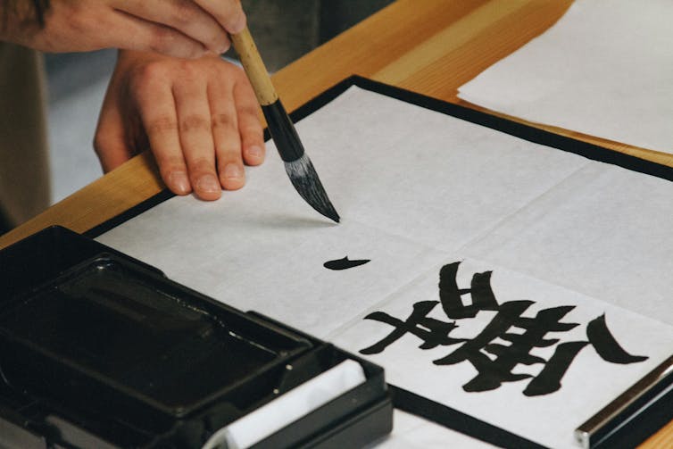
One of the oldest handwriting practices still in use today is Chinese calligraphy, which enables self-expression through skilful use of brushstrokes and composition. Chinese calligraphy gives equal value to the parts of the scroll that are blackened with the ink, and to those parts left unfilled.

For centuries, calligraphy was shaped by cultural, philosophical and artistic concepts. It established itself as one of the most significant forms of traditional and modern art in China. Perhaps more importantly, it served as a prominent medium for daily cultivation of the human mind and character.

Its basic tools are a soft brush, Xuan paper (traditionally made from tree bark and rice straw) and ink. But true artists would argue that a good piece of calligraphy cannot be accomplished without a clear mind, sincerity, humility and self-restraint.

Hand holding a brush and writing a Chinese character
Traditional Chinese calligraphy.
Niketh Vellanki/Unsplash

As generative AI takes on more writing tasks, humans are turning from writers into prompting masters and editors of machine-generated content. This brings the risk of us becoming disconnected from our own creative ideas.

While the quality of AI-generated text may often be sufficient, the writing process is significantly different. As American historian Timothy Snyder argued in the “ninth lesson” from his book On Tyranny, poor use of words make us more susceptible to manipulation and suppression.

The multi-sensory experience of handwritten calligraphy fosters a deeper connection with the writer’s insights, emotions and surroundings. Writing with a brush requires slowing down and patient introspection. Because it demands attentiveness to posture and movements, a calligrapher’s body is grounded in the physical world – and such moments can have lasting benefits for our sometimes overwhelmed, restless minds.

Writers like Nicholas Carr and Aden Evens bring attention to the ongoing rewiring of our minds and reshaping of our abilities, caused by the excessive amount of time we spend online. They claim that while technology can enhance certain skills, it may also alter fundamental aspects of our thinking, behaviour and relationships.

For instance, constant engagement with technology can diminish our attention spans and deep-reading abilities, leading to superficial information processing.

And according to artist and author James Bridle, our tech-dependency and over-reliance on automated systems easily blinds us to bias, simplification and bad data generated by machines.

Reinvention of the brush

Through deep concentration and focus on the transient present moment, calligraphy allows practitioners to let go of distractions and cultivate a sense of inner peace.

Ink artist Pan Jianfeng, born in Rui’an, China and now living in Porvoo, Finland, embraced handwriting with a brush as a modern pursuit of self-cultivation, creative freedom and intimate human communication. For the past decade, he has committed to rediscovering the soft brush as a tool that knows no boundaries in culture, language or time.

Pan’s unique strategies of letting artworks grow through experimental use of paper and brush invite us to reconsider meaning of the “content generation”, “human creativity” and “communication”.

By generating largely unpredictable images using only traditional organic materials (water, ink, brush and paper) and his body, he shows us possibilities to engage with concepts beyond our expectations and imagination – without adding to the burden on the environment, as generative AI does.

And by creating playful artworks that value ambiguity and understatement, and – contrary to the mindset fostered by computational thinking – reject any single, inviolable answer, Pan seeks to open spaces of conversation, creative confusion and shared negotiation of meaning.

Pan Jianfeng creating his work, Building Happiness.

Both in his art and the “One Breath Workshops” he occasionally holds, Pan advocates for mindful handwriting which does not generate more content in an age already saturated with information and misinformation – but rather, removes the superfluity and brings a sense of stillness and peace.

Machines would struggle with text or image recognition in Pan’s ink scrolls such as Northern Ocean (2023) or Unregistered Calligraphy (2024). But human audiences enjoy the game of imagination and discovery.

In the ongoing exhibition Ink Roamings, curated by Shao-Lan Hertel in the Museum of East Asian Art in Cologne, visitors take time to discuss and guess the possible meanings together. Or they quietly contemplate Pan’s artworks in search of own truth.

“People have little trust in themselves and believe too much in technology, so they easily get lost,” Pan told me in an interview for my upcoming book on his work. “I don’t think we need more content – we need a better understanding of the world with all its challenges, and of each other. Through my writing, I try to craft more time and space for this understanding – not less.”


This article features references to books that have been included for editorial reasons, and may contain links to bookshop.org. If you click on one of the links and go on to buy something from bookshop.org The Conversation UK may earn a commission.


Looking for something good? Cut through the noise with a carefully curated selection of the latest releases, live events and exhibitions, straight to your inbox every fortnight, on Fridays. Sign up here.


The Conversation

Karolina Pawlik received research funding from Xi’an Jiaotong-Liverpool University for her project “Soft Brush, Creativity and Cross-Cultural Communication” (2023-2025).

ref. How the art of Chinese calligraphy can bring creative freedom in the age of AI – https://theconversation.com/how-the-art-of-chinese-calligraphy-can-bring-creative-freedom-in-the-age-of-ai-262466