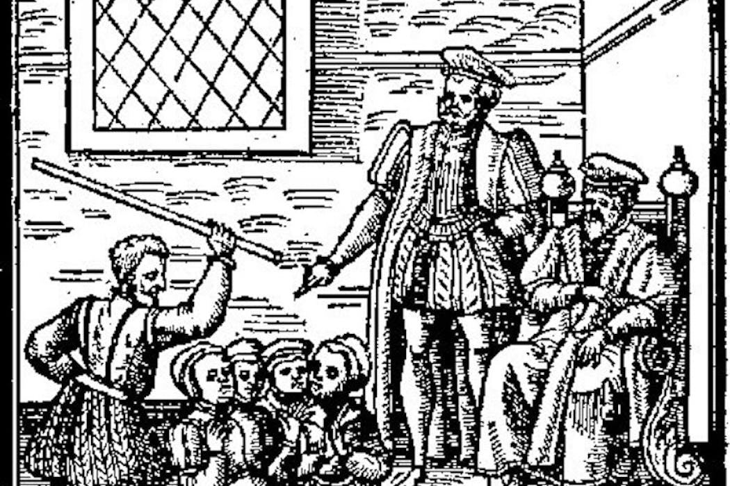
Suspected witches kneeling before James VI in Daemonologie, his 1597 treatise on witches. Wikimedia Commons
In the 16th century, witches and demons weren’t just for Halloween. People were terrified and preoccupied with them – even kings.
In 1590, James VI of Scotland – who was later also crowned James I of England – travelled by sea to Denmark to wed a Danish princess, Anne. On the return journey, the fleet was hit by a terrible storm and one of the ships was lost.
James, a pious Protestant who would go on to sponsor the translation of the King James bible, was convinced he’d been the target of witchcraft. On his return, he set in motion the brutal North Berwick witch trials.
A few years later, James decided to write a treatise called Daemonologie, setting out his views on the relationship between witches and their master, the devil.
Meanwhile, another firm Halloween favourite – ghosts – had fallen out of favour in the wake of the Protestant Reformation because they were seen as a hangover from Catholicism.
In this episode of The Conversation Weekly podcast, Penelope Geng, an associate professor of English at Macalester College in the US who teaches a class on demonology, takes us back to a time when beliefs around witches, ghosts and demons were closely tied to religious politics. She explains how these beliefs have come to influence the way witches and ghouls have been portrayed in popular culture ever since:
It seemed that at a very grassroots level, people believed in the existence of witches and devils. At a very high theological level, writers were talking about it. So I think, compared to today, the early modern period really was a moment in which people were somewhat obsessed with thinking about this eternal struggle between good and evil and their own place in this warfare.
You can also read an article Penelope Geng wrote on the difference between ghosts and demons, and the way they were portrayed in literature, as part of The Conversation’s Curious Kids series.
This episode of The Conversation Weekly was written and produced by Katie Flood, Mend Mariwany and Gemma Ware. Mixing by Eleanor Brezzi and theme music by Neeta Sarl.
Listen to The Conversation Weekly via any of the apps listed above, download it directly via our RSS feed or find out how else to listen here. A transcript of this episode is available on Apple Podcasts or Spotify.
Penelope Geng does not work for, consult, own shares in or receive funding from any company or organisation that would benefit from this article, and has disclosed no relevant affiliations beyond their academic appointment.
Meanwhile, the single-use plastic packaging used to reduce food wastage poses a more insidious problem. Once discarded, the single-use plastics that cushion, seal, protect and extend the shelf life of our groceries can linger in landfills, beneath the ground, in rivers and on the seabed for centuries.
This mounting plastic waste could disrupt ecosystems, negatively effect food security through declining animal health and cause health issues in people. If binning good-to-eat food has historically been reviled as consumers’ great moral failing, their over-reliance on single-use plastic food packaging could be a longer-lasting sin.
The rest was incinerated, land-filled, or shipped abroad, typically to countries with weaker waste management systems. There it is buried, burned or haphazardly stored with the risk of leaking into rivers and seas.
Traces of plastic have been detected everywhere from Arctic ice to the hottest deserts, from the bellies of seabirds to human blood, lungs and placentas. Unlike food waste, the damage of plastic waste is cumulative, slowly imparting a toxic legacy throughout ecosystems for future generations.
The scale of the single-use plastics problem is not to diminish the problem of food waste. Throwing out a pack of mackerel fillets or a tub of smashed avocado from the fridge is not only disrespectful to the third of UK children under five living in food insecure homes. It disregards the huge amount of carbon emissions needed to produce, preserve, transport, retail and store those items from producer to consumer.
An estimated 16 million tonnes of carbon dioxide is produced from UK households’ wasted consumable food and drink. But damaging as it is, food waste has an end point: it decomposes, breaks down, then returns to the soil.
In contrast, plastic packaging persists indefinitely, slowly fragmenting into smaller parts and disintegrating into stubborn chemical constituents that stick around. Each plastic bottle, crisp packet and meat tray that ends up in the natural environment represents a long-term alteration of the material world.
Food waste decays, plastic stays
Why then does binning plastic packaging rarely invite as fervent a reaction as scraping a plate of uneaten dinner into the bin? Our research suggests that part of the answer lies in how each act of wastage is morally framed.
Food is very visible, desirable and morally loaded – it is something held dear in most religions and communities. Several faiths explicitly denounce the wasting of food as sinful or wrong. Secular British history too is replete with memories of food shortages, rationing, rising prices and austerity periods which have led to strong moral attitudes against food waste.
According to the anti-poverty charity Trussell Trust’s research, approximately 14 million people in the UK faced hunger in the past year leading up to September 2025.
Binning good-to-eat food is usually considered morally unacceptable. 5PH/Shutterstock
By comparison, plastic is more abstract. Plastic food packaging is hidden in plain sight, often serving as a “passenger” rather than a driver of our consumption. After we remove the food, we toss plastic packaging into the trash – ideally the recycling bin – without a further thought.
Where food is deep-seated in moral and even sacred meanings around nourishing the body, sharing and caring, identity and celebration, plastic is devoid of such values. Throwing food away can feel like an affront to the communities we identify with, but binning plastic does not carry the same stigma. We do not view ourselves as “wasting” plastic, we merely “dispose” of it.
Among the members of 27 households we interviewed, many expressed their frustration about good-to-eat food ending up in bins or landfills. Most cited the usefulness of plastic packaging in keeping food fresh and helping to reduce waste.
For them, the consequences of binning plastics are dispersed and delayed. No great cautionary tale from our collective memory exists to warn us of the complex, longer-term challenges that will follow.
To overcome the challenges of tomorrow, we must reassess the hierarchy of things that we, as consumers, feel guilty about. Food waste certainly matters, but so too does plastic packaging. The problem is that plastics have not been a part of our moral economy for very long.
Plastics arrived as a modern convenience, not as a moral appendage to our sense of identity or community like food has been for millennia. There are no ancient and collective traumas tied to plastics’ wanton consumption, abuse or scarcity, no prayers of gratitude for plastic packaging, and no great piety or moral proverbs condemning its thoughtless disposal.
Our existing moral frameworks are coloured with images of hunger, famine, bread lines and emaciated bodies that provide us with the imagination to condemn the wasting of food.
But we require new stories and perspectives to position plastic waste as an evil that will outlive us, haunt our waterways, crowd the stomachs of wildlife, leach into our food systems, and poison our bodies long after our shopping habits have changed.
Don’t have time to read about climate change as much as you’d like?
James Cronin received funding from the UKRI Natural Environment Research Council as co-investigators of the ‘Plastic Packaging in People’s Lives’ (PPiPL) project. Project Reference: NE/V010611/1. More can be read about the PPiPL project here: https://www.lancaster.ac.uk/ppipl/
Alexandros Skandalis received funding from the UKRI Natural Environment Research Council as co-investigators of the ‘Plastic Packaging in People’s Lives’ (PPiPL) project. Project Reference: NE/V010611/1. More can be read about the PPiPL project here: https://www.lancaster.ac.uk/ppipl/
Charlotte Hadley received funding from the UKRI Natural Environment Research Council as co-investigators of the ‘Plastic Packaging in People’s Lives’ (PPiPL) project. Project Reference: NE/V010611/1. More can be read about the PPiPL project here: https://www.lancaster.ac.uk/ppipl/
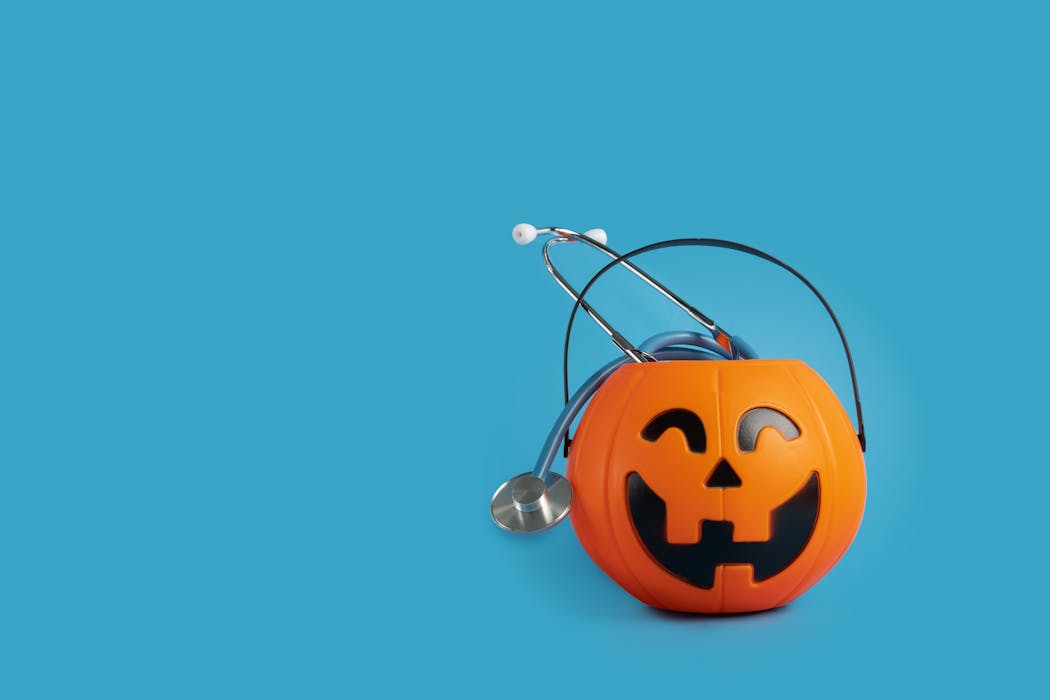
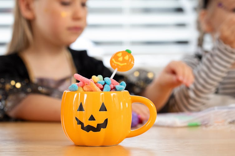
While Halloween offers a chance to embrace all things spooky and supernatural, the real terrors this season aren’t confined to ghost stories. From pumpkin-carved fingers to contact lens infections that can lead to life-threatening heart conditions, the festivities come with genuine medical hazards – some surprisingly severe.
In the US, 44% of Halloween-related injuries stem from pumpkin carving, ranging from minor scratches to lacerations that slice through major nerves, blood vessels and tendons. Specific pumpkin carving knives or tools have been shown to be much safer, though not risk-free.
Pumpkins pose additional dangers when candles are lit inside them. The flames can ignite property or costumes, often leaving victims with severe burns. There is a notable spike in burn-related injuries each year around Halloween, particularly among children. One high-profile case involved TV personality Claudia Winkelman’s daughter, Matilda, who suffered life-changing injuries in 2014, aged eight, when her Halloween costume caught fire.
Costumes themselves create multiple hazards beyond burns. Ill-fitting outfits can lead to broken bones from slips and trips, while masks and heavy headwear obscure vision. Latex allergies from costume materials represent another risk, causing anything from irritation and rashes through, in very rare cases, to death .
The combination of dark October evenings and dark costumes creates a particularly dangerous scenario. Data from the UK covering 27 years revealed that on Halloween, the risk of children being killed or seriously injured in traffic accidents is higher than on any other day – and 34% higher between 5pm and 6pm, probably coinciding with rush hour.
In the US, childhood pedestrian deaths are fourfold higher on Halloween than any other day. A separate study found there are four additional pedestrian deaths on Halloween compared with other days.
On Halloween, appearances can be deceiving – sometimes literally. Coloured contact lenses present significant risks to eye health and overall wellbeing. They can cause irritation and redness, eye injury when they snap and cut into the eye, or even a life-threatening heart infection.
Damage to the eye, from ill-fitting or poor quality contact lenses, can promote bacterial growth. These bacteria can migrate from the eye, often in the bloodstream, to elsewhere in the body. One location they can set up camp is in the heart, causing conditions such as infective endocarditis, which kills about one in five people with the condition. This condition is challenging to treat because medicines and immune cells struggle to reach the heart lining.
Face paints carry both short- and longer-term risks. Skin irritation and pore-blocking can be an immediate annoyance, along with corneal scratches if paint enters the eyes. Ingestion and prolonged or repeated exposure can increase the risk of absorbing potentially toxic elements such as heavy metals and arsenic, which increase cancer risk.
Plastic fangs and other teeth-modifying sets can damage teeth. Designed as one-size-fits-all products, they’re likely to loosen teeth and exacerbate existing looseness. If using adhesive to hold them in place, ensure it’s approved for dental use. Products like superglue and nail glues will damage tooth enamel – a layer that cannot regenerate – and can burn the gums and inside of the mouth.
The obvious concern on Halloween is feeling unwell from consuming excessive sweets or chocolate. However, other consumption hazards have emerged in recent years. Hospital admissions for children who’ve ingested gummies containing THC or otherbanned substances have increased noticeably in countries that have legalised or decriminalised cannabis.
For those watching their calorie intake, sugar-free options may backfire – a phenomenon sometimes referred to as “Halloween diarrhoea”. Sorbitol, an artificial sweetener used in sugar-free products, is only about 60% as sweet as sucrose, meaning more must be added to achieve the desired taste. As little as 20g of sorbitol can have a laxative effect in 50% of healthy people. For context, a stick of sugar-free chewing gum contains roughly 1.25g.
Hard sweets present a choking risk year-round, but particularly to younger children, and the increased sweet consumption around Halloween elevates this risk further. Children with nut allergies face additional jeopardy – the incidence of nut-related anaphylaxis increases by approximately 70% on Halloween.
Beyond food, other Halloween traditions carry risks. Trauma to the eye from eggs used as projectiles is commonly seen during the festivities, with some victims losing their sight from such injuries.
Certain crimes and resulting injuries also increase around Halloween, with assaults showing a significant increase. The commercialisation of Halloween celebrations is thought to play a role, with promotional drink offers partly to blame.
Sensible precautions – wearing lights or reflective strips when out with children, moderating sweet intake, and supervising tasks like pumpkin carving – can substantially reduce the risk of becoming another Halloween hospital statistic.
Adam Taylor does not work for, consult, own shares in or receive funding from any company or organisation that would benefit from this article, and has disclosed no relevant affiliations beyond their academic appointment.
“Hubble bubble toil and trouble” is a quote from Shakespeare’s Macbeth that conjures images of evil witches making potions in giant cauldrons. But the truth was that women persecuted as witches were probably legitimate healers of the time.
Prior to the 14th century, women healers were generally tolerated throughout Europe, offering one of the only kinds of medicine available at the time. But from the 14th to the mid-18th century, with the rise of university education, coupled with the increasing power of the church, women healers were often demonised.
Valuable medicinal knowledge may have gotten lost along the way. To rediscover this ancient knowledge, researchers are looking in more detail at some of the major ingredients used in these medicines and assess their scientific worth through a modern lens.
Some of the most famous potions documented in records of medieval treatments were said to contain exotic ingredients such as eye of newt, toe of frog, wool of bat, tongue of dog and adder’s fork. But these were actually synonyms for plants and not animal parts.
Although, animal parts such as frogs and toads were indeed also used in other recipes used by the healers of the time, often for their psychoactive properties.
The majority of the plants folk healers used were native to Europe. But there were also some exotic ingredients, obtained through the spice trade, which began as early as the fifth century.
Eye of newt is mustard seed, most likely the European species Sinapis alba. Modern research has shown it has anti-cough, anti-asthma, anti-inflammatory, anti-nerve damage, anti-androgenic, cardioprotective and anti-tumour effects.
The classical formulations containing dried mustard seed, handed down from ancient medical books or ethnic medical experience, are now widely used in herbal clinics.
Wool of bat is common holly leaves, and has been shown to reduce high levels of fats in the blood, including high cholesterol. It also contains some compounds that are toxic and so self-medication isn’t recommended.
Tongue of dog is actually a plant known as hound’s tongue, attributed to the long leaf shape. It has a history of use across the world for a variety of ailments including malaria, hepatitis and tuberculosis.
The presence of group of natural compounds called pyrrolizidine alkaloids render it highly toxic to the liver. This means that any research showing medicinal promise has to be viewed with some caution.
Adder’s fork refers most likely to the fern, English adder’s tongue, primarily used in folk medicine for wound healing and for promoting healthy blood circulation. It has also been exploited for its skin-enhancing properties by the cosmetic industry.
Witches’ brews
Witchcraft and folk healing are two different arts. However, medieval folk healing did involve elements of superstition, astrological lore and even pagan ritual and so the line between compassionate healer and witch could easily be misrepresented by those in power.
Flight ointments, sleep potions and love potions are often mentioned both in historical records and fictional literature. Commonly containing a potent class of chemical compounds called tropane alkaloids (a class that also includes cocaine), these concoctions would have had some interesting effects.
Flight ointments were applied to a broomstick and to parts of the body with blood vessels close to the surface to aid absorption. There has been much colourful debate as to the exact parts of the body that these ointments were applied to, but the extremities are most frequently mentioned.
This could be viewed as an early form of transdermal application, now found in the delivery of some drugs such as nicotine patches.
These alkaloids, derived from plants of the Solanaceae (potato) family, including deadly nightshade and henbane have intoxicating psychoactive effects, including feelings of lightness, delirium and hallucinations. These effects could easily be experienced as feelings of flying.
Sleep potions often used extracts from foxglove and extracts from the plant Indian snakeroot, containing the drug reserpine, the world’s first drug treatment for high blood pressure. It was reportedly rediscovered after the founder of the Indian herbal medicine company, Himalaya, observed its calming effects on restless elephants during a trip to Burma in the 1930s, hundreds of years after its use in medieval times.
Together these plants and their compounds produce symptoms such as reduced heartbeat, inhibition of adrenaline release and drowsiness, all things that might aid in a restful night’s sleep.
Love potion recipes called for ingredients such as the mandrake plant Mandragora officinalis. The root is a rich source of the same alkaloids found in the sleep potions.
This may appear counter-intuitive but higher doses of these compounds are known to produce increased heartbeat, palpitations and sweating rather than drowsiness. Other plants such as Ephedra sinica (containing a stimulant called ephedrine) and psychoactive Areca catechu (betel nut) have stimulant and euphoric effects linked to increases in adrenaline and serotonin.
A sleep potion can be transformed into a love potion, and should love turn to hate, a further increase in dosage would transform these plants into poisons. So it’s unsurprising that accusations associated with poisoning and witchcraft were more commonplace during the heightened witch hunts of the 16th and 17th centuries as a means to prosecute women healers under the law.
Prosecutions for witchcraft didn’t come to an end in England until the early 18th century when the 1736 witchcraft act repealed earlier legislation and made it a crime to either pretend to be a witch or to accuse someone of practising witchcraft.
Following the 1736 act, the witches (and folk healers) were left alone for a while although still encountered difficulties from the church and establishment at times. Nonetheless the act of prescribing potions continued.
The practice of prescribing herbal pills, potions and salves as a herbal medicine practitioner eventually became a legitimate occupation. It’s one still dominated by women to this day.
Anthony Booker is affiliated with The British Pharmacopoeia, The Medicines and Healthcare Products Regulatory Agency, The American Botanical Council, The British Herbal Medicine Association and The European Scientific Cooperative on Phytotherapy.
Plans to reform support for children with special educational needs in England have been delayed after the government announced its new policy would not be unveiled until 2026, rather than autumn 2025.
However, there has already been some indication of what the government will do. The education secretary, Bridget Phillipson, recently promised to set “clear expectations for schools” on how they work together with pupils’ parents. She also outlined her intention to overhaul the process by which parents can make complaints.
In a statement, Phillipson said: “To help us deliver the most effective set of reforms we can, I have taken the decision to have a further period of co-creation, testing our proposals with the people who matter most in this reform – the families – alongside teachers and other experts.”
The additional wait for the schools white paper that will set out the policy will be disappointing to those who are keen to see change in the system. But it also creates an opportunity to ensure the government gets reform right.
As an expert in inclusive education, I argue the call for closer collaboration and the explicit mention of family involvement are excellent signs. However, the government should rethink its framing of parental engagement as a set of expectations that schools must meet.
On paper, this approach looks as if it could safeguard the support children are entitled to. But in reality it risks reducing what can be a mutually respectful and beneficial partnership to a transactional checklist and added bureaucracy.
What is needed instead is effective partnerships with families based on authentic engagement and courageous conversations, based on respect, openness and compassion.
This change in culture can be supported by improved teacher training. This should promote inclusion as a shared responsibility, rather than as sheer accountability.
For example, for children with additional needs, transitions in their educational journey are important and potentially difficult moments. These include starting school, moving between primary and secondary, between mainstream and alternative educational provision, and into adulthood.
Making family involvement happen
Parents and carers can and should play an important role in their children’s education, and their voices should have power. This is particularly vital for children with special educational needs and disabilities.
Parents know their children best. They see their strengths, struggles, and the little things that make a big difference. Irrespective of this, they are routinely excluded or sidelined from decisions about their child’s education.
A recent House of Commons committee report on special educational needs highlights that many parents feel treated as inconvenient or unreasonable. These adversarial dynamics have severely eroded trust in the system.
Findings from an all-party parliamentary group inquiry into “loss of the love of learning” reveal that parents lose confidence in formal education: it’s perceived as a source of anxiety, stress and exclusion for children whose needs may require different teaching and learning approaches.
For these reasons, parental involvement must be central to reform of special educational needs support. Joint planning, emotional support, and coordination at every stage with teachers and others involved in the child’s journey is needed. This can help children adjust and reach emotional and developmental milestones.
We need to move away from a situation where parents are seen only as receivers of expertise, not as experts themselves.
Parents’ knowledge and experiences of disability and difference can lead to real change. It’s right that they are involved in decision making, at school and community level and in national consultations on education policy.
Parents’ experiences and knowledge can offer real value. Rido/Shutterstock
Without real input in decision making, the risk is that parental involvement becomes tokenistic rather than transformative, especially when deep-rooted systemic injustices remain in education for children with special educational needs.
Decent parental engagement requires other changes to the system. Children with special educational needs and disabilities often receive support from different services. These need to be coherent so that parent and carer involvement does not become fragmented. The Education Select Committee’s call for a joint workforce strategy on special educational needs and disabilities, including health and care services, must be taken seriously.
Equally, trust and respect needs to be reinstated towards teachers and Sencos: teachers who have an additional role as their school’s special educational needs coordinator. Despite often working in extremely hard conditions and with limited resources, teachers often absorb demonising attitudes and blame.
Sencos are not allocated the time and continued training required for their role. They also do not have the power to make strategic decisions on inclusion.
The Labour manifesto promised to “light the fire” of opportunity for every child. By truly bringing families into their children’s education, the upcoming white paper on schools could be that spark. Otherwise, it risks becoming another layer of bureaucracy in an already overwhelmed system.
Paty Paliokosta does not work for, consult, own shares in or receive funding from any company or organisation that would benefit from this article, and has disclosed no relevant affiliations beyond their academic appointment.
Source: The Conversation – UK – By Samuel Jesse Cox, Postdoctoral Fellow and Visiting Lecturer in English Literature, University of Tübingen
The Rose Field, the third and final volume in Philip Pullman’s The Book of Dust trilogy is finally in the hands of his readers.
This trilogy accompanies Pullman’s earlier series, His Dark Materials, and tells stories that happen both before and after those original books. Both trilogies follow Lyra Belacqua and her daemon, Pantalaimon – a manifestation of her soul in animal form. In The Rose Field, Lyra journeys deep into the desert for one final discovery about the mysterious substance that connects both series: Dust.
The title of Pullman’s first trilogy comes from John Milton’s 17th-century epic poem Paradise Lost, which tells the story of Satan’s rebellion against Heaven. In it, Milton wrote: “Unless th’ Almighty Maker them ordain / His dark materials to create more worlds.”
In Milton’s poem, the “dark materials” are the chaotic and primordial matter from which God could create new worlds. In Pullman’s stories, however, “dark materials” take the form of Dust – also called shadow particles, Rusakov particles, or dark matter.
Unlike Milton’s lifeless matter, Dust is alive and connected to consciousness and creativity. Through this idea, Pullman turns Milton’s vision upside down, rejecting divine authority and celebrating human imagination.
Across both trilogies, two opposing views of Dust exist. A restrictive theocratic organisation known as the Magisterium declares Dust original sin: “an emanation from the dark principle itself.” Yet due to Dust’s association with daemons and consciousness, Lyra, Pan and their allies remain convinced that Dust must be “good”.
To fully understand Pullman’s Dust we must go beyond Paradise Lost, back to the foundational story in the Judeo-Christian tradition: Genesis.
Dust thou art?
Northern Lights (1995) describes how Dust takes its name from a “curious verse” in the story of Adam and Eve’s fall in Genesis. In it, God curses Adam for eating forbidden fruit saying: “For dust thou art, and unto dust shalt thou return.”
In this moment, Adam and Eve leave behind their innocent, harmonious life with nature. Pullman pinpoints this as the moment in the Bible where a rift opens between humanity and the material world. From then on, humans move from living in unity with the material world to feeling separate from it, forced to struggle against nature instead of living alongside it.
The scholar Mary talking to Dust in the BBC adaptation of The Amber Spyglass.
In Pullman’s inversion, the Authority (God) did not simply create using Dust, but was, like all angels, formed from it. As one of the rebel angel characters explains in the final book of the original trilogy, The Amber Spyglass (2001): “Dust is only a name for what happens when matter begins to understand itself. Matter loves matter. It seeks to know more about itself and Dust is formed.”
This line reveals that Dust is not just connected to the human spirit – our thoughts, feelings, imagination and soul – but also presents a view of reality shaped by matter itself. Through Dust, ideas about the soul are linked to a sense of wonder at the material world.
This echoes the ancient Greek and Roman philosophers who first imagined the universe as made up of moving atoms. Yet throughout His Dark Materials, there is still a sense that humans are special, as human consciousness appears as the culmination of matter understanding itself.
New forms of alienation
In the Book of Dust trilogy, this shifts radically. Pullman has acknowledged that his new books are increasingly shaped by our current times, in which our detachment from our world is enabling the destruction of Earth.
For Pullman, belief in God has passed onto belief in another entity which will save us from the world and its toil: technology. If the split between humans and matter estranged us from the material world, now we face being alienated even from ourselves.
In this new context of alienation, Pullman’s concept of Dust evolves. It moves from being primarily associated with human creativity to implying that human consciousness is intrinsically linked to all matter.
As he writes in La Belle Savage (2017), the first instalment in the Book of Dust trilogy: “There is a field of consciousness that pervades the entire universe, and which makes itself apparent most fully – we believe – in human beings.”
After boldly overthrowing the figure of God (the Authority) in The Amber Spyglass, Pullman seems intent on challenging today’s dominant way of thinking by helping people rediscover a deeper, more imaginative relationship with the physical world.
If we see matter as just lifeless stuff that can only be measured or used, then humans aren’t really powerful – instead, we become spiritually and creatively impoverished.
Philip Pullman speaking about Dust.
In The Secret Commonwealth (2019), the second book in the Book of Dust trilogy, Lyra has fallen victim to this new disease, which grips the young of her world. A belief that: “Nothing is any more than what it is.” This separates her from her daemon Pan, who must set off in search for her “imagination”.
His Dark Materials offered a story of the endless battle against authoritarian and restrictive structures. Lyra and Pan’s final adventure in The Rose Field, meanwhile, is an allegorical search for those most human of qualities, in which society now holds a faltering faith: feeling and imagination.
Dust becomes a rich symbol that shows how deeply and permanently we’re connected to everything in the world – that we’re part of it, not separate from it.
The beauty of Pullman’s “Dust” is that we don’t need to inhabit Lyra’s world to see that this is true. The physical qualities of Dust tells us we are deeply connected to everything and everyone. We have the remnants of stars within us, as do even the most seemingly inert objects in our world.
The Roman poet Horace once declared: “We are but dust and shadow.” But in a world in a crisis of narration, we need storytellers like Pullman to illuminate our forgotten particles and darkest materials with light.
Looking for something good? Cut through the noise with a carefully curated selection of the latest releases, live events and exhibitions, straight to your inbox every fortnight, on Fridays. Sign up here.
This article features references to books that have been included for editorial reasons, and may contain links to bookshop.org. If you click on one of the links and go on to buy something from bookshop.org The Conversation UK may earn a commission.
Samuel Jesse Cox does not work for, consult, own shares in or receive funding from any company or organisation that would benefit from this article, and has disclosed no relevant affiliations beyond their academic appointment.
Suspected witches kneeling before James VI in Daemonologie, his 1597 treatise on witches. Wikimedia Commons
In the 16th century, witches and demons weren’t just for Halloween. People were terrified and preoccupied with them – even kings.
In 1590, James VI of Scotland – who was later also crowned James I of England – travelled by sea to Denmark to wed a Danish princess, Anne. On the return journey, the fleet was hit by a terrible storm and one of the ships was lost.
James, a pious Protestant who would go on to sponsor the translation of the King James bible, was convinced he’d been the target of witchcraft. On his return, he set in motion the brutal North Berwick witch trials.
A few years later, James decide to write a treatise called Daemonologie, setting out his views on the relationship between witches and their master, the devil.
Meanwhile, another firm Halloween favourite – ghosts – had fallen out of favour in the wake of the Protestant Reformation because they were seen as a hangover from Catholicism.
In this episode of The Conversation Weekly podcast, Penelope Geng, an associate professor of English at Macalester College in the US who teaches a class on demonology, takes us back to a time when beliefs around witches, ghosts and demons were closely tied to religious politics. She explains how these beliefs have come to influence the way witches and ghouls have been portrayed in popular culture ever since:
It seemed that at a very grassroots level, people believed in the existence of witches and devils. At a very high theological level, writers were talking about it. So I think, compared to today, the early modern period really was a moment in which people were somewhat obsessed with thinking about this eternal struggle between good and evil and their own place in this warfare.
You can also read an article Penelope Geng wrote on the difference between ghosts and demons, and the way they were portrayed in literature, as part of The Conversation’s Curious Kids series.
This episode of The Conversation Weekly was written and produced by Katie Flood, Mend Mariwany and Gemma Ware. Mixing by Eleanor Brezzi and theme music by Neeta Sarl.
Listen to The Conversation Weekly via any of the apps listed above, download it directly via our RSS feed or find out how else to listen here. A transcript of this episode is available on Apple Podcasts or Spotify.
Penelope Geng does not work for, consult, own shares in or receive funding from any company or organisation that would benefit from this article, and has disclosed no relevant affiliations beyond their academic appointment.
As Halloween approaches, the air fills with excitement. Costumes are planned, pumpkins are carved, and the promise of sweet treats is everywhere. But while dipping into chocolates and colourful candies may seem harmless, some ingredients in these festive favourites can cause trouble for people taking certain medications or living with specific health conditions.
From artificial sweeteners to liquorice and chocolate, Halloween sweets can interact with medicines or worsen some conditions in ways that may reduce their effectiveness or even trigger harmful side effects. Here’s what the science says, and why you might want to glance in your medicine cabinet before raiding the treat bowl.
1. Chocolate
Chocolate treats are everywhere this time of year, but for people taking monoamine oxidase inhibitors (MAOIs), one of the older types of antidepressant, they can carry unexpected risks. MAOIs are usually prescribed when first line antidepressants have not been effective. These drugs work by blocking an enzyme in the body called monoamine oxidase, which helps control levels of brain chemicals linked to mood. When this enzyme is blocked, it also prevents the breakdown of a natural substance called tyramine, which is found in certain foods such as chocolate, cheese and cured meats.
When someone on MAOIs eats tyramine-containing foods such as chocolate, tyramine can build up to dangerous levels. This can cause blood vessels to tighten, leading to a sudden and severe spike in blood pressure, which is a medical emergency that can be fatal if untreated.
Exactly how much chocolate is risky depends on the dose and type of MAOI, as well as the kind of chocolate and your individual sensitivity. There’s no universally “safe” amount, but even small portions of dark chocolate, which contains more tyramine, can sometimes cause problems. Milk chocolate usually contains much less tyramine, but doctors generally advise caution or avoidance altogether, especially during the early stages of treatment or at higher doses. If in doubt, it’s safest to check with your pharmacist or prescriber before indulging.
2. Caffeine
Chocolate also contains caffeine, a stimulant that can interact with medicines used to treat attention-deficit hyperactivity disorder (ADHD), anxiety, and heart problems.
Caffeine and ADHD drugs such as methylphenidate (Ritalin) are both nervous system stimulants, although they work in slightly different ways. Together they can intensify each other’s effects, leading to jitteriness, insomnia, and a racing heartbeat. This can make it harder to manage ADHD symptoms effectively.
A 50-gram bar of dark chocolate usually contains less than 25 milligrams of caffeine, while milk chocolate contains less than 10. That might not seem much, but when combined with coffee, tea, or energy drinks, caffeine intake can quickly add up. The Food Standards Agency advises that up to 400 milligrams a day is unlikely to cause side effects for most adults.
However, the safe limit during pregnancy is much lower: no more than 200 milligrams a day (about two cups of instant coffee). Exceeding that has been linked to increased risk of miscarriage and low birth weight. Sensitivity to caffeine can also vary depending on health conditions, medications, and individual metabolism, so people taking heart or mental health drugs may need to be especially cautious.
3. Liquorice
Liquorice is the ultimate love-it-or-hate-it treat. But if you’re a fan, it’s best to eat it sparingly. Black liquorice contains glycyrrhizin, a natural compound that acts like the hormone aldosterone. This can cause the body to hold on to sodium and lose potassium, leading to fluid retention, increased blood pressure and electrolyte imbalances.
These effects can be especially dangerous for people taking diuretics, antiarrhythmic drugs, or blood pressure medication, and for those with kidney disease. Even small amounts of liquorice can make a difference. A 2024 study found that just 100 milligrams of glycyrrhizic acid daily can raise blood pressure. That is the same as the upper limit recommended by the World Health Organization. If you have a heart or kidney condition, it’s safest to avoid large amounts altogether. Liquorice-flavoured sweets that do not contain real liquorice are usually fine.
4. Artificial sweeteners
Sugar-free sweets are often marketed as healthier, but they can come with their own risks. Many contain artificial sweeteners such as aspartame, which can be dangerous for people with phenylketonuria (PKU), a rare genetic disorder. Aspartame breaks down into a chemical called phenylalanine, which people with PKU cannot properly metabolise. This leads to a toxic buildup that can damage brain cells.
Phenylalanine may also be indirectly converted into tyramine, which means that consuming aspartame might contribute to higher tyramine levels. Like chocolate, this could interact with MAOI antidepressants and cause a dangerous rise in blood pressure, although more research is needed to confirm this link.
5. Food colourings
Halloween sweets are known for their bright colours, but those vibrant hues often come from synthetic dyes such as Red 40, Yellow 5, and Blue 1. These dyes have been linked to hypersensitivity reactions including hives, wheezing and itching. One study found that people who are allergic to aspirin may be more likely to react to Yellow 5.
For anyone taking antihistamines, these dyes can make things worse. They don’t clash chemically with the medicine, but they can trigger the body to release histamine – the very substance antihistamines are meant to block – or provoke allergic reactions of their own. To make matters worse, some antihistamines also contain artificial dyes, so the treatment can end up feeding the problem.
Research has also found a connection between artificial food colourings and increased hyperactivity in some children.
A few sweets won’t ruin your night, but if you take medication or have a medical condition, it’s worth being mindful. Read ingredient labels, go easy on chocolate, sugar-free sweets, or liquorice and check with your doctor or pharmacist if you are unsure.
After all, the scariest part of Halloween should be the costumes, not what’s hiding in your sweets.
Dipa Kamdar does not work for, consult, own shares in or receive funding from any company or organisation that would benefit from this article, and has disclosed no relevant affiliations beyond their academic appointment.
Source: The Conversation – UK – By Chloe Ward, Senior Lecturer in the History of British Art, Queen Mary University of London
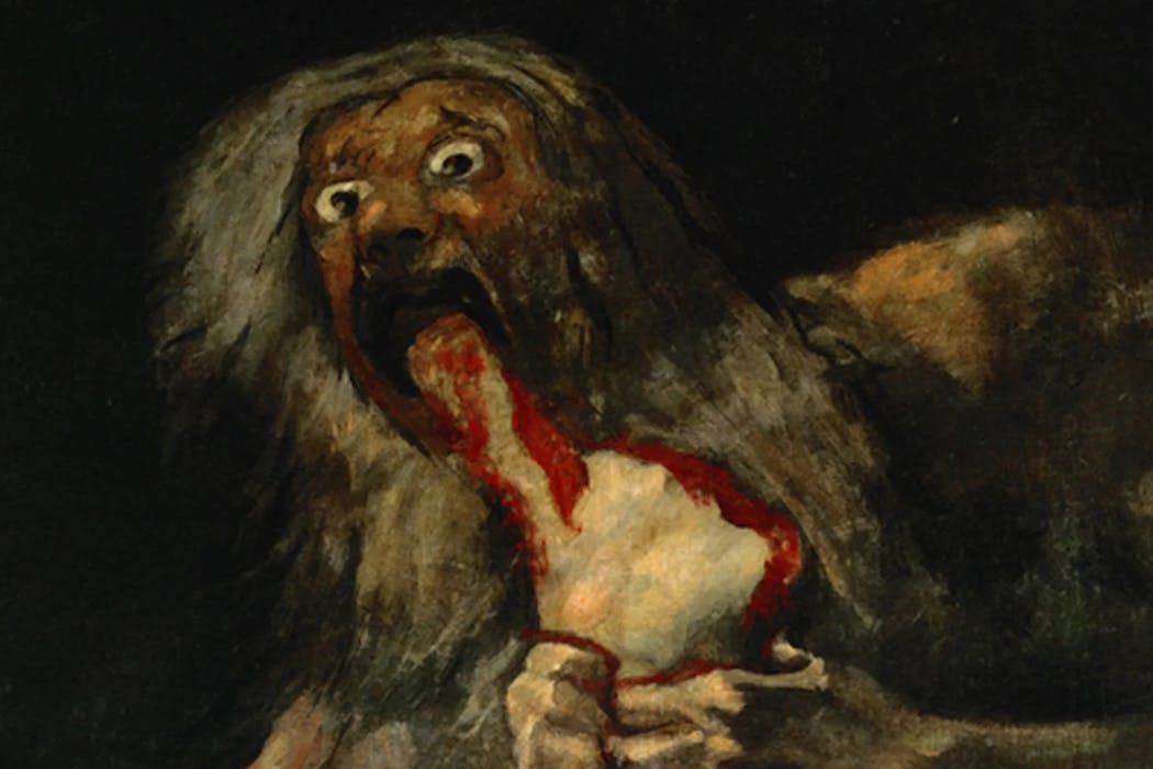
Saturn Devouring His Son by Francisco Goya (1820-1823). Museo del Prado
With Halloween approaching, we asked seven of our academic experts to tell us about the most unsettling artwork they’ve ever encountered. From gruesome portraits to creepy critters, these are the paintings that have stayed with them long after their first glimpse.
L’inhumation Précipitée by Antoine Wiertz (1854)
Hardly anything is more terrifying than the idea of being buried alive. In Antoine Wiertz’s painting, a cholera victim, presumed dead, revives in the crypt. Lifting the coffin lid, he glimpses a human skull through the gloom. A spider scrambles towards the open lid, while a rat slinks into an adjacent coffin. His face contorts with horror at his realisation: he has awakened into a nightmare worse than death.
L’inhumation Précipitée by Antoine Wiertz (1854). Wiertz Museum
In 18th and 19th century Europe, the fear of premature burial was rife, and, while rarer than people imagined, the anxiety was not entirely unfounded. During epidemics, bodies were buried hastily and there were few accurate techniques for confirming death.
To guard against the grim possibility of being buried alive, some people specified that their arteries be cut or their heads severed before they were buried. Instant death was preferable to the horror of live burial that Wiertz so frighteningly portrayed.
Chloe Ward, senior lecturer in the history of British art, Queen Mary University of London
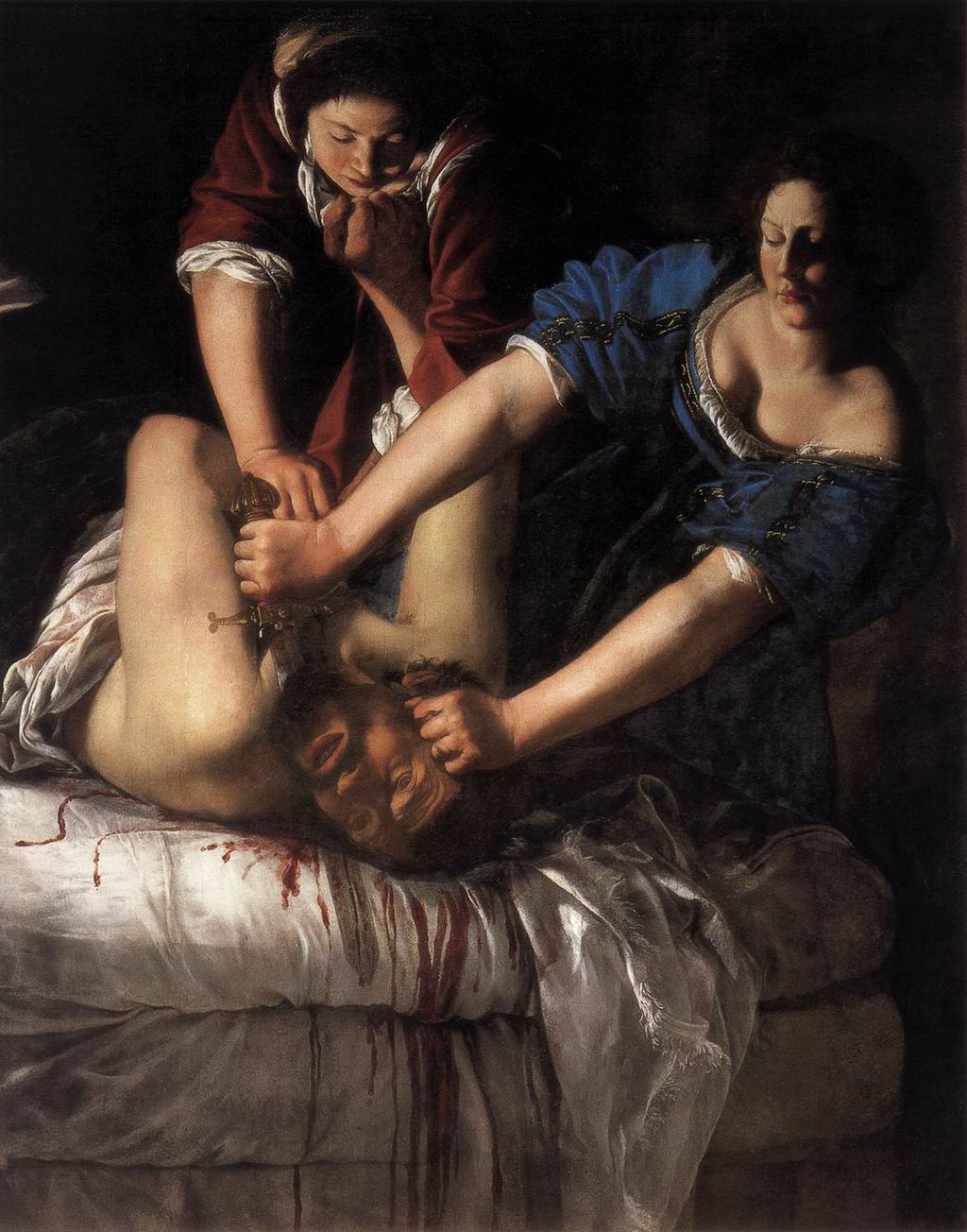
Judith Murdering Holofernes by Artemisia Gentileschi (1620)
The sheer visceral impact of this painting is heightened by its composition. Our eyes are drawn to the partially severed head of the still-struggling Holofernes.
The story comes from the Book of Judith, which is included in Catholic and Eastern Orthodox bibles. To save her city from this Assyrian general, Judith has set forth to seduce and murder him, aided by her servant Abra.
Judith Murdering Holofernes by Artemisia Gentileschi (1620). Uffizi Gallery
The vivid yellow and blue of the women’s dresses and the red of Holofernes’ bed contrast with the background chiaroscuro (an effect of contrasted light and shadow). This gives the artwork a claustrophobic intensity. Gentileschi painted this subject twice. But it is her 1620 version that is considered the more powerful.
In it she has shown blood spurting parabolically from Holofernes’ wounds, spattering Judith’s arms. Yet it is the grim determination of Judith and the death agonies of her victim that, for me, transports the viewer into the private moment of a gruesome murder.
Pippa Catterall, professor of history and policy, University of Westminster
Saturn Devouring His Son by Francisco Goya (1820-23)
Painted in the aftermath of the Napoleonic wars and during Spain’s revolution of 1820-23, this nightmarish image is the most powerful of Spanish painter Francisco Goya’s 14 “black paintings”.
Said to depict Saturn (or Cronus in Greek myth) eating one of his children to prevent a prophecy that one will usurp him, it gruesomely combines the taboos of cannibalism and filicide (killing your own child). The pure black background forces the viewer to fixate on the dismembered corpse, Saturn’s strangely angular body and the madness in his eyes.
Saturn Devouring His Son by Francisco Goya (1820-23). Museo del Prado
The title was not Goya’s, and the suggestion that this is a remote mythological scene or an allegory of time destroying youth may be attempts to distance ourselves from its darker meaning.
Beneath such efforts, this painting unflinching depicts the callousness of power, the urge to destroy rivals, the old exploiting the young. Two centuries on, it remains a chilling depiction of raw human instincts when the mask of civilisation is torn away.
Karl Bell, associate professor of cultural and social history, University of Portsmouth
Three Studies for Figures at the Base of a Crucifixion by Francis Bacon (1944)
Fleshy bioforms with outstretched, eel-like necks are writhing in an orange space. They are sightless, but two of them have toothy open mouths: one is snarling, the other is screaming. They are simultaneously human and not human.
These abject creatures are the creation of the Irish-British artist Francis Bacon in his work Three Studies for Figures at the Base of a Crucifixion (1944). The artist completed the triptych over two weeks, fuelled by alcohol and hangovers.
The figures are intended to represent the ancient Greek furies: deities of vengeance from the underworld. The work’s exhibition date is poignant: it was first shown to the public in the final days of the second world war in Europe. Terror leaps out of these paintings: they are at once a visceral reminder of our mortality and bodily materiality, and an expression of the horrors that humans have inflicted upon each other. And we cannot look away.
Daisy Dixon, lecturer in philosophy, Cardiff University
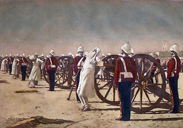
Blowing from Guns in British India by Vassily Vereshchagin (1884)
This painting by the Russian painter Vassily Vereshchagin depicts the execution of a group of rebels, the Kuka, after an uprising in Malerkotla, Punjab, in 1872. The British struck back harshly, executing the Kukas by blowing from guns. The rebels were tied to the mouths of cannons, which were then fired.
Blowing from Guns in British India by Vasily Vereshchagin (1884). Wiki Commons
There is no indication that Vereshchagin witnessed the Kuka event himself. He had probably seen illustrations of the Indian rebellion of 1857, with similar compositions.
This painting was exhibited in London’s Grosvenor Gallery as part of a trilogy showing execution methods in different parts of the world. This framing is disturbing, at least to me – placing the brutal scene in combination with the detached, quasi-ethnographic mission. There is another disturbing dimension: the tension between the painting as a anti-colonial-violence statement or as a piece of political propaganda targeting the rule of the British empire.
The original painting, in storage at University of California, Berkeley, was destroyed due to water damage around 1950. A photogravure in grayscale of the work still exists, as does as a colour sketch, now exhibited at the Russian Museum in St Petersburg.
Åsa Harvard Maare, senior lecturer in visual communication, Malmö University
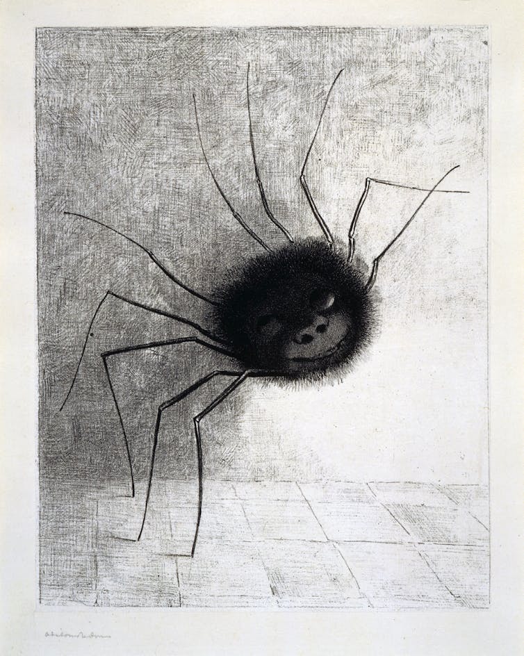
The Spider by Odilon Redon (1881)
Imagine a giant spider with ten legs and a grinning, human face emerging from the shadows in the corner of your room. The French artist Odilon Redon created this nightmarish anthropomorphic creature largely from his imagination, but was also inspired by the experience of viewing nature through a microscope.
Melancholic and introspective from childhood, he was introduced to the world of bugs by the botanist Armand Clavaud. Redon’s imagination was also fuelled by decadent literature such as Charles Baudelaire’s The Flowers of Evil (1857) or Edgar Allan Poe’s gothic poem The Raven (1845).
Working mainly in charcoal and lithograph, he was inspired to produce a whole series of black-and-white images – monstrous creatures and giant, floating eyes – that expressed his subconscious fears. Known as his “Noirs” (black pictures), they evoked his obsession with the terrifying, nightmarish visions that are invisible by day. The writer Joris Karl Huysmans defined them as: “A new type of fantasy, born of sickness and delirium.”
Frances Fowle, emeritus professor of 19th-century art, University of Edinburgh
Disasters and Fairy Tales by Cindy Sherman (1980s)
The artist Cindy Sherman uses her own body as the blank canvas for her art: she dresses up in makeup, prosthetics, wigs and disguises and photographs the results against carefully staged backdrops. The resulting images are often deliberately unsettling.
In her series Disasters and Fairy Tales from the 1980s, she played a series of characters from horror films and nightmarish folklore. The image that I find most difficult to look at is not the goriest or most grotesque, but Untitled #165 (1986), in which a hybrid, part-human, part-animal creature in a gingham dress lurks bashfully behind a tree.
What does it want? Is it malevolent, or just lonely? This creature seems to embody the dark things we don’t want to acknowledge in our psyche, that we push away, but which linger on the edges of our consciousness. As Sherman’s self-portraiture implies, these nightmarish things are not monsters from elsewhere, but versions of ourselves.
Catherine Spooner, professor of literature and culture, Lancaster University
Is there a petrifying painting that has stuck in your imagination? Let us know in the comments below.
Looking for something good? Cut through the noise with a carefully curated selection of the latest releases, live events and exhibitions, straight to your inbox every fortnight, on Fridays. Sign up here.
This article features references to books that have been included for editorial reasons, and may contain links to bookshop.org. If you click on one of the links and go on to buy something from bookshop.org The Conversation UK may earn a commission.
The authors do not work for, consult, own shares in or receive funding from any company or organisation that would benefit from this article, and have disclosed no relevant affiliations beyond their academic appointment.
Plaid Cymru’s overwhelming victory in the recent Caerphilly Senedd byelection shattered over a century of political tradition. Lindsay Whittle took the seat with 15,691 votes. Labour, which had held the seat since it was created, came away with just 3,713 votes.
Reform came second to Plaid, with 12,113 votes. And while this was an impressive performance, the fact that it failed to win Caerphilly even after vast amounts of time and money spent on the campaign has led to speculation that tactical voting played a part in this byelection.
A big clue that tactical voting was at work in Caerphilly was the recorded turnout. Typically, byelections in Wales have been low-key affairs. Turnouts are low and incumbents generally win. The national average for a Senedd vote in a constituency has never tipped over 50%. In Caerphilly, turnout climbed from 44% in the 2021 election to 50.4% in this byelection.
And while local voters clearly backed Plaid Cymru for plenty of reasons, the extremely low vote count for other parties does suggest at least some lent their vote to Plaid to keep out Reform. The Conservative vote collapsed to fewer than 700 votes and the Lib Dems and Greens, so often the recipients of tactical votes themselves, each took just 1.5% of the votes in Caerphilly.
Anecdotes from the vote count support this. The BBC recounted “extraordinary stories” of habitual supporters of the Conservatives, a pro-union party, voting Plaid to block Reform.
The increased turnout and Plaid’s 27.4% swing both suggest a mobilisation, triggered by polling and a wider national narrative which persuasively contends that Reform is ahead of other parties. Does the result therefore imply that Reform can be beaten elsewhere if voters take the right approach to tactical voting?
Reform entered the Caerphilly race with no prior foothold in the constituency. The party mobilised heavily and, it had seemed, effectively. Nigel Farage and other senior Reform figures made multiple visits to the area to campaign for their candidate, Llŷr Powell. Pre-election polls, including one by Survation which had Reform leading Plaid by 42% to 38%, raised expectations of a breakthrough.
And it is true that Reform’s ultimate 36% vote share reflects its growing appeal among disaffected working-class voters. It did capitalise on the same anti-establishment sentiment that has seen the party top UK-wide polls for much of the past year.
Yet, the result also exposes Reform’s vulnerabilities. As with the Hamilton, Larkhall and Stonehouse byelection for the Scottish parliament earlier in the summer, Reform failed to convert intensive campaigning into victory.
The role and reach of tactical voting
Underneath the hype, Farage is unpopular. Polls suggest as many as 60% of voters are opposed to him being prime minister. That presents an opportunity for opponents to unite behind a more broadly acceptable candidate.
In this volatile political era, where voters show little loyalty to tradition, smaller parties like Plaid Cymru, the SNP, Greens and even Pro-Gaza independents could frame themselves as the “real alternative” to Reform. Depending on local dynamics, they could attempt to draw tactical support.
It should be noted, however, that tactical voting cuts both ways. While it denied Reform a victory in Caerphilly, the party could attract tactical support from Conservative voters eager to oust Labour governments.
In England, without equivalents to Plaid or the SNP to siphon anti-establishment sentiment, Reform may consolidate its grip on working-class disillusionment. This trend was evident in Labour’s collapse in the Runcorn and Helsby Westminster byelection in May 2025, which enabled Reform to take the seat.
In Caerphilly, Labour’s vote fell amid grievances including the slow pace of change to improve living standards, policy u-turns and a fatigue with Welsh Labour, which has been in power in the Senedd since its creation in 1999.
Such grievances can be felt across the UK more broadly – with winter-fuel policy u-turns, and a general dissatisfaction with how long it is taking Labour to deliver on promises to improve living standards. Concern about immigration is also used to punish Labour in both the regular voting intention polls and at the ballot box in council byelections.
An anti-Reform majority does exist – and it has shown up in several contests, including in races Reform has ultimately won but on less than 50% of the vote. Harnessing this anti-Reform majority, however, requires a level of co-ordination rarely seen in the UK’s electoral history.
Unlike the 1997 anti-Conservative wave, there is no single opposition brand. Instead, the anti-Reform vote is split across Labour, Liberal Democrats, Greens, nationalists and independents – and, arguably, the Conservatives too.
In Caerphilly, we saw this fragmentation briefly turn into coalescence. This implies that a clear polling trigger, showing Reform ahead in a seat, can focus the minds of voters and drive tactical thinking. It also helped that these voters were offered a Plaid candidate with deep community roots and a strong, progressive message.
What is potentially harder in a general election is the presentation of a local contest as extremely high stakes in the media. Caerphilly drew unprecedented attention precisely because it was being framed as a test case for Reform in Wales, which may explain the level of anti-Reform vote.
In a multi-polar UK, the anti-Reform majority is real – but not pro-any one party by default. Importantly, it is anti-populist, anti-incumbent and regionally variable. Nearly all of the mainstream parties on the centre ground and left wing of politics are claiming to be the real alternative to Reform.
Reform’s path to power lies in building a lead that is too large for tactical voting to overcome, or in electoral systems which reward vote share over seat efficiency. This is why it remains hopeful of success in May 2026 in Wales, where the election is being held under a proportional voting system.
As the UK heads towards the 2026 devolved elections and a likely 2029-30 general election, Caerphilly offers a blueprint for resistance to Reform’s national surge. It also offers a warning for the other parties: stopping Reform is not the same as winning.
Thomas Lockwood does not work for, consult, own shares in or receive funding from any company or organisation that would benefit from this article, and has disclosed no relevant affiliations beyond their academic appointment.


