Suplemento cultural: la lluvia de Jane Austen

Source: The Conversation – (in Spanish) – By Claudia Lorenzo Rubiera, Editora de Cultura, The Conversation

Jane Bennet, en la adaptación cinematográfica de ‘Orgullo y prejuicio’, estornudando después de verse sorprendida por una tormenta. IMDB

Este texto se publicó por primera vez en nuestro boletín Suplemento cultural, un resumen quincenal de la actualidad cultural y una selección de los mejores artículos de historia, literatura, cine, arte o música. Si quiere recibirlo, puede suscribirse aquí.


Soy asturiana. Lo digo para que se entienda que, viniendo de donde vengo, la lluvia me ha pillado en más de una ocasión sin paraguas y me ha calado hasta los huesos. Y aquí sigo.

Por eso, cuando comencé a leer las novelas de Jane Austen no entendía el jaleo que se montaba cada vez que una de las protagonistas se iba a pasear, se veía sorprendida por las nubes, y volvía a casa empapada flirteando con el riesgo de morir por un resfriado. Marianne Dashwood en Sentido y sensibilidad, una dramática adorable, es el mejor ejemplo de esto.

Con el tiempo aprendí que una mojadura en los años 90 o 2000 no era lo mismo que una a principios del siglo XIX. Así lo cuenta Ana Fernández Mosquera. También deja caer que, no obstante, aunque Austen estuviese interesada en temas sanitarios, era todavía más partidaria de utilizarlos como giros narrativos. Porque si Jane Bennet no se hubiese puesto malísima en casa de Charles Bingley (después de una tormenta), Elizabeth no hubiese tenido que acudir a socorrerla y, de paso, intimar con el desagradable pero tentador señor Darcy.

Si lee esto desde algún sitio tórrido, me pareció un bonito detalle empezar hablando de frío, agua y bajas temperaturas, aunque solo fuese para engañar a la mente.

Decidir qué es bello

Confesaré que la primera vez que Lara López Millán me expuso el tema de la belleza en las imágenes de las redes sociales, me pareció que era algo interesante, sí, pero que afectaba a un puñado de gente, tal vez numeroso pero no abrumador.

Sin embargo, estaba equivocada. Como ella bien explica, por un “sesgo de confirmación óptico”, en base a lo que hemos elegido en determinados momentos, un algoritmo selecciona las imágenes que vamos a recibir en redes, las que cree que nos van a gustar, determinando por nosotros qué vamos a considerar bello.

Y aunque parece que solo hablamos de fotografías de Pinterest, el subtexto es mucho más importante y existencial. Porque si alguien comienza a decidir por nosotros qué es bello y qué no, sin que nos demos cuenta, se abre la puerta a que el mundo se acabe volviendo un lugar más homogéneo y claustrofóbico.

Graciela Iturbide, mirar con dignidad

Este año Graciela Iturbide ha sido galardonada con el Premio Princesa de Asturias de las Artes, que recogerá en Oviedo en otoño.

Y coincidiendo con este reconocimiento, la Fundación Casa de México en España ha inaugurado una retrospectiva de la fotógrafa mexicana en Madrid que estará abierta hasta septiembre y que muestra algunas de sus imágenes más representativas.

A través de sus ojos, como nos cuenta Francisco Quirarte, Iturbide convence de que mirar “es un acto de amor y resistencia”.

Escuchar un slow with you tonight

Desde hace unos años se ha puesto de moda el movimiento slow food, como reacción a la comida rápida y, en general, a la aceleración del mundo en el que vivimos.

Nosotros, en el verano de 2024, nos dimos a la slow music, que no es música lenta para bailar agarrao’ (como diría Luis Eduardo Aute), sino una propuesta para seleccionar álbumes de música de diferentes géneros que merezca la pena escuchar sin hacer nada más: ni las tareas de casa, ni el trabajo, ni ejercicio ni nada.

La idea acabó con una serie ecléctica de discos para reproducir, sentarse (permitimos también pasear lentamente) y atender.

La ropa que nos define

Como ovetense que soy (para concretar todavía más la asturianía ya anunciada), me he pasado las últimas semanas viendo a gente pasear por la calle con diferentes camisetas del equipo de fútbol del Real Oviedo (para quien no sepa de qué hablo, hemos subido a Primera división después de 24 años).

Entre lo que hacían mis conciudadanos y el blokecore, la tendencia de vestir, por puro gusto estético, camisetas de fútbol, hay una finísima línea (¿ese señor que se hace una foto delante de la Torre Eiffel con vaqueros y camiseta del Liverpool es un red o sigue la moda?). Y esa línea, como explica Sandra Bravo, es tanto estética como cultural.

Hablando de ropa, las más afortunadas estarán leyendo esto no con camiseta y pantalones sino al lado del mar y protegidas bajo una sombrilla (el cuidado ante todo), vestidas con un bikini… “Bikini”, una interesante palabra compuesta por bi-, que significa dos, y -kini, que significa… nada.

Rosalía Cotelo García disecciona la etimología de la prenda veraniega por excelencia y la de toda una familia de palabras cuya raíz nos hemos inventado.

Y cerramos la sección de moda con un ramillete de prendas que ahora nos son desconocidas pero que eran habituales en los escenarios teatrales del Siglo de Oro.

The Conversation

– ref. Suplemento cultural: la lluvia de Jane Austen – https://theconversation.com/suplemento-cultural-la-lluvia-de-jane-austen-262534

Pourquoi un ventilateur donne-t-il un sentiment de fraîcheur ?

Source: The Conversation – in French – By Coralie Thieulin, Enseignant chercheur en physique à l’ECE, docteure en biophysique, ECE Paris

Il fait 32 °C dans votre salon. Vous allumez le ventilateur, et en quelques secondes, une sensation de fraîcheur vous envahit. Pourtant, la température de l’air n’a pas changé. Alors, comment un simple souffle peut-il nous faire croire qu’il fait plus frais ? Pourquoi recommande-t-on aujourd’hui d’y ajouter un brumisateur ?

Ce phénomène, bien plus subtil qu’il n’y paraît, s’explique à l’interface entre physique et biologie au niveau de la peau ; et implique bien sûr notre système nerveux en ce qui concerne la perception sensorielle.


Contrairement à ce qu’on pourrait penser, un ventilateur ne refroidit pas l’air : il se contente de le mettre en mouvement. D’ailleurs, un ventilateur électrique émet un peu de chaleur en raison de son moteur qui convertit l’énergie électrique en chaleur.

Dans une pièce isolée de 1 mètre cube maintenue à -30 °C, un ventilateur peut faire monter la température de 1 °C : on voit bien que l’effet est minime et sans impact sensible dans la plupart des situations.

Ce que le ventilateur modifie, c’est notre perception. Il crée une sensation de fraîcheur, sans réellement baisser la température. Cette impression vient de notre propre corps, qui réagit aux flux d’air en activant ses mécanismes naturels de régulation thermique.

Pour comprendre cette sensation de fraîcheur, il faut donc s’intéresser à la manière dont notre organisme gère sa température interne. Car c’est là, dans les échanges constants entre notre peau, l’air et notre système nerveux, que se joue le vrai mécanisme du rafraîchissement.

En effet, le corps humain fonctionne un peu comme une machine thermique : il produit de la chaleur en permanence (quand on bouge, digère…).

Le rôle de la transpiration pour garder notre température interne à 37 °C

Pour éviter la surchauffe interne, l’organisme active un système de refroidissement très efficace : la transpiration.

Quand vous avez chaud, votre peau libère de la sueur. En s’évaporant, la sueur consomme de l’énergie (qu’on appelle la « chaleur latente de vaporisation ») : elle absorbe de la chaleur de votre corps. La sueur lui vole en quelque sorte des calories, ce qui le refroidit.

Mais ce mécanisme dépend beaucoup des conditions extérieures. Si l’air ambiant est chaud et humide, l’évaporation de la sueur devient moins efficace, car l’air est déjà presque saturé en humidité et est moins susceptible d’absorber celle de votre sueur. Résultat : vous continuez à transpirer, mais sans évaporation efficace, la sueur stagne sur la peau et n’extrait plus de chaleur. Autrement dit, elle ne vole plus les calories à votre peau qui permettraient à votre corps de se refroidir.

C’est là qu’intervient le ventilateur ! En brassant l’air saturé autour de la peau, le ventilateur le remplace par de l’air plus sec, ce qui favorise l’évaporation et aide votre corps à se refroidir.

En complément, l’utilisation d’un brumisateur apporte un refroidissement supplémentaire en projetant de fines gouttelettes d’eau sur la peau.

En ajoutant des gouttelettes, on augmente la quantité d’eau disponible pour l’évaporation, ce qui permet d’extraire davantage de chaleur de la peau et d’intensifier le refroidissement.

L’association du brumisateur et du ventilateur optimise le confort thermique dans les climats chauds en maximisant l’évaporation. En revanche, lorsque l’air est très humide et saturé de vapeur d’eau, ce mécanisme est inefficace, car l’évaporation est limitée.

Ainsi, le brumisateur est particulièrement performant dans les environnements secs, où l’air peut absorber facilement l’humidité, tandis que le ventilateur favorise le renouvellement de l’air humide autour de la peau, évitant ainsi la saturation locale et maintenant un gradient favorable à l’évaporation.

Brasser de l’air

Mais ce n’est pas tout. Même sans sueur, votre corps transfère de la chaleur à l’air ambiant : c’est la convection.

Cela signifie que l’air en contact avec votre peau se réchauffe légèrement. Quand l’air est immobile, cette couche d’air chaud reste collée à la peau comme une fine couverture.

En mettant l’air en mouvement, le ventilateur dissipe la fine couche d’air chaud qui entoure votre peau. Cela permet à la chaleur d’être évacuée plus rapidement, ce qui provoque une sensation quasi immédiate de fraîcheur.

Plus précisément, des chercheurs ont montré que, lorsque la vitesse de l’air augmente, l’évaporation de la sueur peut croître de près de 30 % pour une vitesse d’air de 2 mètres par seconde (ce qui équivaut à environ 7 kilomètres par heure). Parallèlement, la perte de chaleur par convection s’intensifie également grâce au renouvellement constant de l’air chaud proche de la peau.

Ce phénomène s’appelle l’« effet de refroidissement éolien », ou wind chill. Il explique pourquoi, en hiver, un vent fort peut vous faire ressentir un froid bien plus intense que la température réelle : par exemple, un 0 °C accompagné de vent peut être perçu comme -10 °C, car votre corps perd sa chaleur plus vite.

Température réelle, température ressentie

En été, c’est le même principe : le souffle du ventilateur ne fait pas baisser la température de la pièce, mais il favorise la perte de chaleur corporelle, donnant l’illusion que l’air ambiant est plus frais. C’est une température ressentie plus basse, pas une température réelle.

Un ventilateur est donc bien un allié optimal. Il n’abaisse pas la température de l’air, mais accélère la perte de chaleur de votre corps. Il facilite ainsi vos mécanismes naturels de refroidissement tels que l’évaporation de la sueur, la convection de la chaleur, la perception sensorielle de l’air en mouvement.

En réalité, l’air reste à la même température : c’est vous qui refroidissez plus vite… et votre cerveau traduit cette perte de chaleur par une agréable sensation de fraîcheur !


À lire aussi :
Des canicules au froid glacial, comment corps et cerveau s’allient pour percevoir la température


Ce processus n’est pas trivial. Il repose sur une interaction complexe entre des récepteurs sensoriels situés dans la peau et des régions spécifiques du cerveau, notamment le cortex insulaire postérieur. Ces récepteurs détectent les variations de température corporelle et transmettent ces informations au cerveau, qui les intègre pour générer une sensation consciente de fraîcheur.

Ainsi, ce que vous ressentez comme une fraîcheur agréable est en réalité une perception cérébrale fine et sophistiquée de la baisse réelle de la température de votre corps.

The Conversation

Coralie Thieulin ne travaille pas, ne conseille pas, ne possède pas de parts, ne reçoit pas de fonds d’une organisation qui pourrait tirer profit de cet article, et n’a déclaré aucune autre affiliation que son organisme de recherche.

– ref. Pourquoi un ventilateur donne-t-il un sentiment de fraîcheur ? – https://theconversation.com/pourquoi-un-ventilateur-donne-t-il-un-sentiment-de-fraicheur-262144

Que révèlent vraiment les « premières » images du télescope Vera-C.-Rubin ?

Source: The Conversation – in French – By Pierre-Alain Duc, Directeur de recherche au CNRS, directeur de l’Observatoire astronomique de Strasbourg, Université de Strasbourg

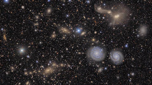
Zoom dans l’amas de la Vierge. Cette image fait partie des « premières » images prises par le télescope Vera-C.-Rubin. NSF–DOE Vera-C.-Rubin Observatory, CC BY

L’observatoire Vera-C.-Rubin vient de débuter un grand sondage du ciel, le Legacy Survey of Space and Time (LSST) et a livré en juin 2025 de « premières » images au grand public : une grandiose visualisation d’une partie de l’amas de galaxies de la Vierge.

Mais de telles « premières » images ont une importance qu’il convient de relativiser, ou tout au moins recontextualiser car leur intérêt n’est pas forcément celui que l’on croit ou voit immédiatement.

Les images de Vera-C. Rubin se distinguent par la taille de leur champ exceptionnellement grande et la rapidité du nouvel observatoire, qui lui permet de cartographier des lumières même ténues sur une grande partie du ciel plusieurs fois par mois.


La « première lumière » d’un nouvel observatoire est un évènement symbolique et médiatique. Les images dévoilées ce jour-là au public ne sont en effet pas les vraies premières acquisitions – ces dernières servent des objectifs purement techniques et n’ont que peu d’intérêt pour le public. Elles ne témoignent pas forcément des buts scientifiques primaires qui ont motivé la construction du télescope. Elles existent essentiellement pour impressionner et susciter l’intérêt : pour cela, elles doivent posséder une valeur esthétique… qui ne doit pas occulter les performances techniques de l’instrument qui les a générées.

En quoi, alors, cette « première » image du sondage Legacy Survey of Space and Time (LSST), centrée sur l’amas de galaxies de la Vierge, est-elle originale et doit-elle nous interpeller ?

Parce qu’elle dévoile des astres encore inconnus ?

Pas tout à fait. Les structures les plus remarquables, visibles sur cette image, étaient familières, comme ce couple de spirales vues de face (au centre, à droite), cette galaxie naine mais étonnamment étendue et diffuse (en haut à droite) ou, enfin, ces spectaculaires traînées stellaires qui relient plusieurs galaxies d’un groupe situé à l’arrière-plan (en haut à droite), fruits de collisions en cours qui arrachent les étoiles à leurs galaxies.

Ces queues dites « de marée » avaient déjà été cartographiées par des caméras d’ancienne génération, comme Megacam sur le vénérable Canada-France-Hawaii Telescope (CFHT).

Parce que sa qualité optique est exceptionnelle ?

Obtenue depuis le sol, et subissant la turbulence de l’atmosphère qui floute toute lumière venue de l’espace, sa finesse est loin des standards des télescopes spatiaux Hubble, James-Webb ou Euclid, qui présentent une résolution spatiale de 5 à 10 fois meilleure.

Parce qu’elle présente d’éclatantes couleurs ?

Certes, mais depuis que le sondage du Sloan Digital Sky Survey (SDSS) a démarré en 2000, il a systématiquement observé une grande partie du ciel dans des bandes devenues standards (u,g,r,i,z) et a combiné ses images pour produire de « vraies couleurs ». Le public s’est habitué à une vision colorée des objets astronomiques.


À lire aussi :
Comment sont façonnées les images du ciel? Dans les pas du télescope pionnier Hubble


Désormais, chaque nouvelle mission utilise sa propre palette qui varie selon le jeu utilisé de filtres.

Parce qu’elle dispose de canaux de diffusion importants ?

Certainement ! Les États-Unis ont une culture de médiation scientifique bien plus développée qu’en Europe, et leurs agences, dont le département de l’énergie américain et la Fondation nationale pour la science qui portent le projet LSST, accordent des moyens financiers conséquents aux actions de communication, relayées par l’ensemble des partenaires, parmi lesquels, en France, le CNRS dont l’Institut nucléaire et particules est chargé, entre autres, d’une grande partie de la chaîne de traitement des données.

Mais faut-il pour autant faire la fine bouche face à cette belle, mais pas si originale image produite par le LSST ? Assurément, non ! Elle mérite vraiment de s’y intéresser – non donc par ce qu’elle montre, mais par ce qu’elle cache !

Ce que cachent les premières images du nouveau télescope Vera-C.-Rubin et de son sondage LSST : un potentiel énorme et une prouesse technique

Ce qui est réellement derrière cette image, c’est un potentiel scientifique énorme, lui-même résultat d’une prouesse technique remarquable.

L’image a été acquise avec la plus grande caméra au monde. Elle dispose d’un capteur de 3,2 milliards de pixels (en fait une mosaïque de 189 capteurs CCD), soit 100 fois plus qu’un appareil photo classique.

Cette débauche de pixels permet de couvrir un champ de vue sans précédent de 9,6 degrés carrés, soit 45 fois la taille apparente de la pleine Lune ou 35 000 fois celui de la caméra du télescope spatial Hubble.

Avec cette vision large, le LSST pourra cartographier la surface totale de l’amas de la Vierge en seulement 10 clichés (l’image présentée ici ne couvre qu’une partie de l’amas), et quelques dizaines d’heures d’observations, contre quelques centaines d’heures pour le télescope Canada-France-Hawaii, avec lequel nous osions une comparaison plus haut.

La taille de la caméra du LSST est digne de celle de son télescope, pourvu d’un miroir de 8,4 mètres, le plus grand au monde entièrement consacré à l’imagerie. Avec une telle machinerie, l’ensemble du ciel austral peut être observé en seulement trois jours, des performances idéales pour repérer les phénomènes transitoires du ciel, comme les supernovae ou pour découvrir des astéroïdes dont la position varie d’une image sur l’autre.

Chaque nuit d’observation, les terabytes de données s’accumulent et, pendant les dix ans du sondage, les images vont être empilées pour in fine atteindre une sensibilité inégalée, mettant en jeu une chaîne de traitement complexe sans commune mesure avec celles mises en œuvre pour les sondages anciens.

Cette base de données qui, comme le grand vin, se bonifie avec le temps, permettra d’effectuer des avancées dans de multiples domaines de l’astrophysique, de la physique stellaire à la cosmologie.

Alors, oui, il est tout à fait légitime d’être impressionné par cette première image du LSST et par le potentiel de découvertes qu’elle dévoile.

Et pour finir, il convient de rappeler que l’observatoire qui l’a acquise, installé dans le désert chilien de l’Atacama, honore par son nom l’astrophysicienne Vera Rubin, à l’origine de la découverte de la matière noire dans les galaxies. Donner un nom de femme à un projet astronomique d’envergure est aussi une première !

The Conversation

Pierre-Alain Duc ne travaille pas, ne conseille pas, ne possède pas de parts, ne reçoit pas de fonds d’une organisation qui pourrait tirer profit de cet article, et n’a déclaré aucune autre affiliation que son organisme de recherche.

– ref. Que révèlent vraiment les « premières » images du télescope Vera-C.-Rubin ? – https://theconversation.com/que-revelent-vraiment-les-premieres-images-du-telescope-vera-c-rubin-262066

Nos GPS ont besoin de voir les trous noirs pour fonctionner, mais le wifi et les téléphones portables brouillent leur détection

Source: The Conversation – in French – By Lucia McCallum, Senior Scientist in Geodesy, University of Tasmania

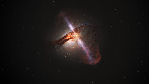
Certains trous noirs servent de points de repère à la géodésie pour localiser précisément la Terre dans l’espace. ESA/Hubble/L. Calçada (ESO), CC BY

La pollution électromagnétique a des conséquences inattendues. Par exemple, l’encombrement du spectre radioélectrique complique le travail des radiotélescopes. Ce que l’on sait rarement, c’est que ces télescopes ne servent pas seulement à faire de la recherche en astronomie : ils sont indispensables à certains services essentiels à notre civilisation… le GPS, par exemple !


Les scientifiques qui mesurent avec précision la position de la Terre sont aujourd’hui confrontés à un problème de taille. Leurs données sont essentielles au fonctionnement des satellites utilisés pour la navigation, pour les télécommunications et pour l’observation de la planète. Ce que l’on sait moins, c’est que ces mesures – issues d’une discipline appelée « géodésie » – dépendent du suivi de trous noirs situés dans des galaxies lointaines.

Le problème, c’est que, pour suivre ces trous noirs, les scientifiques ont besoin d’utiliser des bandes de fréquences spécifiques sur le spectre radioélectrique. Et avec la montée en puissance du wifi, des téléphones portables et d’Internet par satellite, il y a un embouteillage sur ces fameuses bandes de fréquence.

Pourquoi avons-nous besoin des trous noirs ?

Les satellites et les services qu’ils fournissent sont devenus essentiels à la vie moderne. De la navigation ultraprécise sur nos téléphones au suivi du changement climatique, en passant par la gestion des chaînes logistiques mondiales, le fonctionnement des réseaux électriques ou des transactions bancaires en ligne, notre civilisation ne peut pas se passer de ces compagnons en orbite.

Mais pour utiliser les satellites, il faut savoir précisément où ils se trouvent à tout moment. Leur positionnement repose sur ce qu’on appelle la « chaîne d’approvisionnement géodésique mondiale ».

Cette chaîne commence par l’établissement d’un référentiel de coordonnées stable sur lequel baser toutes les autres mesures. Comme les satellites se déplacent sans cesse autour de la Terre, que la Terre elle-même tourne autour du Soleil, et que le Soleil se déplace dans la galaxie, ce référentiel doit être soigneusement calibré à partir d’objets externes relativement fixes.

Or les meilleurs points d’ancrage que l’on connaisse sont les trous noirs, situés au cœur de galaxies lointaines, qui émettent des jets de rayonnement en dévorant des étoiles et du gaz.

Grâce à une technique appelée « interférométrie à très longue base », les scientifiques peuvent relier un réseau de radiotélescopes pour capter leurs signaux et pour dissocier les mouvements de rotation ou d’oscillation de la Terre de ceux des satellites.

Le rôle important des ondes radio

En effet, les radiotélescopes permettent de détecter les ondes radio émises par les trous noirs. Celles-ci traversent l’atmosphère sans difficulté, de jour comme de nuit et par tous les temps.

Mais ces ondes radio sont également utilisées pour les communications terrestres – wifi, téléphonie mobile, etc. L’utilisation des différentes fréquences est strictement encadrée, et quelques bandes étroites seulement sont réservées à l’astronomie radio.

Dans les décennies passées, toutes les bandes étaient encore peu usitées, et les scientifiques n’hésitaient pas à empiéter sur celles non réservées pour mieux capter les signaux des trous noirs… Mais aujourd’hui, si on souhaite que la géodésie atteigne la précision requise par nos technologies, on ne peut plus se contenter des bandes réservées à l’astronomie.

Des usages concurrents

Ces dernières années, la pollution électromagnétique d’origine humaine a explosé. Lorsque le wifi et la téléphonie mobile se sont développés, les scientifiques ont dû se rabattre sur des fréquences plus élevées.

Mais les bandes libres se font rares. Six générations de téléphonie mobile, chacune occupant une nouvelle fréquence, encombrent désormais le spectre, sans compter les milliers de satellites qui envoient directement des connexions Internet vers la Terre.

Aujourd’hui, la multitude de signaux est souvent trop puissante pour que les observatoires géodésiques puissent distinguer les très faibles signaux en provenance des trous noirs – ce qui menace, à terme, le fonctionnement de nombreux services satellitaires.

Que peut-on faire ?

Pour continuer à fonctionner à l’avenir et pour maintenir les services dont nous dépendons, la géodésie a besoin de davantage de bandes de fréquence.

Lors du partage du spectre radio à l’occasion des grandes conférences internationales, les géodésiens doivent absolument être présents à la table des négociations.

Parmi les solutions envisagées, on peut aussi imaginer des zones de silence radio autour des radiotélescopes essentiels. Un travail est également en cours avec les opérateurs de satellites pour éviter que leurs émissions radio ne soient dirigées directement vers ces télescopes.

Quoi qu’il en soit, toute solution devra être globale. Pour les mesures géodésiques, les radiotélescopes sont interconnectés à l’échelle de la planète, ce qui permet de simuler un télescope grand comme la Terre. Or, aujourd’hui, l’attribution des fréquences du spectre radio est principalement gérée par chaque État de manière indépendante, ce qui complique une quelconque coordination.

La première étape est peut-être de mieux faire connaître ce problème. Si nous voulons que les GPS fonctionnent, que les supermarchés soient approvisionnés et que nos virements bancaires arrivent à bon port, nous devons garder une vue dégagée sur les trous noirs des galaxies lointaines – ce qui signifie désengorger le spectre radio.

The Conversation

Lucia McCallum ne travaille pas, ne conseille pas, ne possède pas de parts, ne reçoit pas de fonds d’une organisation qui pourrait tirer profit de cet article, et n’a déclaré aucune autre affiliation que son organisme de recherche.

– ref. Nos GPS ont besoin de voir les trous noirs pour fonctionner, mais le wifi et les téléphones portables brouillent leur détection – https://theconversation.com/nos-gps-ont-besoin-de-voir-les-trous-noirs-pour-fonctionner-mais-le-wifi-et-les-telephones-portables-brouillent-leur-detection-260232

Did the Sun boycott make Liverpool more leftwing? My study indicates it may have shifted views

Source: The Conversation – UK – By Lucas Paulo da Silva, PhD Candidate, Political Science, Trinity College Dublin

Most newspapers in the UK tend to represent a political perspective. It is difficult to measure the extent to which someone’s media consumption affects their political views – but what if you take one newspaper out of the equation?

In a recent study, I sought to examine how the longstanding boycott of the rightwing tabloid the Sun in Liverpool affected people’s political attitudes up to 2004. I found that the Sun – and its removal from the media landscape in Liverpool – held considerable sway.

On April 15 1989, a tragic stadium crush at the FA Cup semi-final football match between Liverpool FC and Nottingham Forest led to 97 deaths and hundreds of injuries. The Sun inaccurately blamed Liverpool supporters for what came to be known as the Hillsborough disaster.

Many newsagents and readers in Liverpool subsequently boycotted the Sun, cutting its circulation in Merseyside to about a quarter of what it had been. Audience and newsagent surveys show that people in Liverpool who had bought the rightwing Sun, often replaced it with more neutral or leftwing newspapers (primarily the Daily Mirror).

In neighbouring parts of the country, there was no such shift in readership. A boycott remains in effect in Liverpool today, despite apologies from the paper in 2004, 2012 and 2016.


Read more:
Why The Sun newspaper will never shine in Liverpool


Now, you’ve probably heard the phrase “correlation is not causation”. There were many other changes that occurred in northern England and Liverpool during the period that I study from 1983 to 2004.

My research sought to avoid confusing the effects of those changes with the effects of the boycott. For example, the period was marked by the Thatcher governments, de-industrialisation and their aftermath. For many in Liverpool those policies of that era were to blame for extremes of poverty and deprivation in the area. Amid that, the Labour party’s Militant faction rose to prominence in Liverpool, taking control of the city council from 1983 to 1986.

These events are central to the politics and social picture of Merseyside that emerged. But to what degree did the boycott of The Sun play a part in shaping it?
My study used a statistical method called triple differences. This meant calculating how political attitudes changed among the Sun’s core audience in Liverpool (the group which was exposed to the boycott) compared to people in Liverpool who were not in the Sun’s core audience, and relative to similar parts of northern England (the control group, which was not exposed to the boycott). I also controlled for other factors that could shift between these groups over time, such as parliamentary constituencies, gender, class, ethnicity, religion, education, union membership and home ownership.

These methods helped me assess the possible effect of the boycott on ideological positions, perceptions of Labour party positions, and Labour party support. I also conducted additional studies to consider whether these shifts began before the boycott, which would suggest that they were due to other factors. The results indicate to me that these shifts in political attitudes began during the boycott (although the data did not permit this test for perceptions of party positions).

I used data from the annual British Social Attitudes surveys administered by the National Centre for Social Research to measure social and political attitudes and demographics. The sample is composed of 12,771 northern English respondents between the years 1983 to 2004, which includes several years both before and during the boycott.

The study identified three main changes in the aftermath of the boycott (and the shift to more leftwing media). First, the boycott may have caused the Sun’s previous audience in Liverpool to perceive the Labour party as less “extreme”. This was compared to other people in Liverpool (whose perceptions of Labour as extreme stayed level) and northern England. It is of course worth noting that this was a period of considerable change in the party, as Tony Blair’s leadership moved it significantly to the centre, though my statistical methods attempt to address this.

The period also saw those former Sun readers in the city adopt more opinions traditionally regarded as left wing, including being in favour of increasing the power of trade unions. “Non-audiences” in Liverpool and other people in northern England were less likely to express a change of view. (Other ideological opinions, about redistribution and European integration, did not shift as much.)

Third, support for the Labour party increased among the Sun’s former core audience in Liverpool, compared to other people in Liverpool (who actually slightly reduced their support for Labour) and people who were not exposed to the boycott. These shifts happened from the beginning of the boycott in 1989 until 1996 (before the Sun endorsed Labour) and continued until at least 2004 (when my data ends).

My study makes use of a real-world change in media consumption that spans many years. The value of the Sun boycott as a “natural experiment” (observing real-world events) was first identified by researchers who found that the boycott reduced Euroscepticism.

Media influence

The Sun famously ran the 1992 headline “It’s The Sun Wot Won It”, claiming credit for the Conservative general election victory. Clearly, newspaper publishers then felt they could influence political views.

But perhaps a more interesting finding from my study is how this may happen. My results suggest to me that media influences how people perceive party positions. This is something that governments, publishers, and critically voters should take into account if they want to address the effects of media on elections.

The Conversation

Lucas Paulo da Silva does not work for, consult, own shares in or receive funding from any company or organisation that would benefit from this article, and has disclosed no relevant affiliations beyond their academic appointment.

– ref. Did the Sun boycott make Liverpool more leftwing? My study indicates it may have shifted views – https://theconversation.com/did-the-sun-boycott-make-liverpool-more-leftwing-my-study-indicates-it-may-have-shifted-views-259488

Can music be good company? Research shows it makes our imagination more social

Source: The Conversation – Global Perspectives – By Steffen A. Herff, Leader of the Sydney Music, Mind, & Body Lab, University of Sydney

Urbazon / Getty Images

Earlier this year, we asked a group of older adults what music they listened to when feeling lonely, and why. We discovered music was a powerful coping mechanism and source of escapism.

Other studies have also found listeners use music “to keep them company”. Such reports suggest music might be able shape listeners thoughts and imagination to provide social solace.

But can we establish scientifically how music affects imagination? In short, can music really be good company? Our latest research tried to find out.

Music and mental images

It’s common to experience mental imagery – that is a mental simulation or imagining something that is not there – while listening to music. Studies have found 77% of music listeners online, 73% of participants in the lab, and 83% of concert-goers report experiences of mental imagery during music listening.

What’s going on here? To get a better understanding, we previously carried out a series of experiments with mental imagery and music.

We showed participants a small clip from a video game called Journey, which featured a small figure travelling towards a mountain. We then asked them to imagine the continuation of the journey.

Participants reported how vivid or life-like their imagination was. In addition, they provided details on distance and time travelled in their mind and shared detailed descriptions of their imagined journeys.

Across multiple studies, we asked hundreds of participants to do the task in silence or while listening to various types of music. We observed much more vivid and emotionally positive imagination when listening to music. In addition, listeners’ imagined longer distances and time travelled when listening to music compared to silence.

A screenshot from a videogame showing a figure travelling towards a distant mountain.
Participants were shown a short clip from the video game Journey, either with or without music, and were asked to imagine a continuation of the journey towards the mountain in the distance.
Thatgamecompany

Music shapes listeners’ imagination

Previous research has also found that what people imagine while listening to music often forms elaborate imagined stories. These share greater similarity among listeners with a shared cultural background.

Thoughts and themes in the imagined stories are shaped by the music. For example, heroic-sounding music induces empowering themes into imagined content.

Occurrences of new events in these imagined stories also tend to be similar between listeners, and are related to the pattern of musical tension and relief.

So there is strong scientific support for the idea that music can indeed affect what is imagined. But can it specifically induce imagined social interactions?

Our latest study is the first to explicitly investigate this question.

Does music make imagination more social?

We asked 600 participants to perform the imaginary journey task, either in silence or while listening to Italian, Spanish or Swedish folk music. To understand the potential effect of vocals and the meaning of lyrics on imagined content, the music was presented with or without lyrics to the participants, half of whom were native speakers and the other half non-speakers of the respective languages.

We then used tools from natural language processing – a set of computational methods for analysing language – to find underlying topics across participants’ reports of their imagined journeys.

A chart showing imagined social interactions within participants' reports of their imagined journeys. People listening to music more commonly imagined social interactions, and a cloud of words including 'people', 'dance', 'village', and other social words.
Imagined themes of social interactions were more common while listening to music than during silence.
Herff et al. / Scientific Reports

One topic stood out: social interaction. Not only was it the predominant topic in participants’ reports of what they imagined, but it was also much stronger while listening to music compared to silence.

This suggests music can indeed affect social thought. The effect was stable regardless of whether listeners’ understood the lyrics or whether there even were lyrics in the first place.

But we can go one step further.

We used a generative AI system which produces images from text prompts (Stable Diffusion) to visualise participants’ descriptions of their imagined journeys.

Example images based on participants imageind content shows a path through a dark forest and a family walking in the mountains.
Example images generated from descriptions during silence (left: ‘I imagined a dark walk, without emotions, alone, looking for some hope’) and music (right: ‘I imagined a walk in the mountains with my family, all together, happy and carefree, we played, we laughed’).
Herff et al. / Scientific Reports

By combining the natural language processing model with the image generator, we could visualise what the language processing model had learned to be a “stereotypical” representation of content imagined during silence and music listening.

An image of a solitary figure on a path (left) and several people dancing in a field (right).
What the computational model learned people tend to imagine during silence (left) and music (right).
Herff et al. / Scientific Reports

The results of the computational model were further supported with manual annotations that showed three times more social interactions in journeys imagined during music listening compared to silence.

A shared imagination of music

Finally, we showed the images created from the descriptions to another group of people.

These people were able to pick out which images showed content imagined during music listening, and which showed content imagined while in silence – but they were only able to do it when listening to the same music that inspired the image.

This shows there is a shared understanding, or “theory of mind” of what another person might imagine while listening to a piece of music.

Taken together, our results suggest music can indeed be good company.

The Conversation

The authors do not work for, consult, own shares in or receive funding from any company or organisation that would benefit from this article, and have disclosed no relevant affiliations beyond their academic appointment.

– ref. Can music be good company? Research shows it makes our imagination more social – https://theconversation.com/can-music-be-good-company-research-shows-it-makes-our-imagination-more-social-262348

As Trump lifts sanctions on Myanmar elites, is he eyeing the country’s rare earth reserves?

Source: The Conversation – Global Perspectives – By Adam Simpson, Senior Lecturer, International Studies, University of South Australia

The military junta that overthrew Myanmar’s democratically elected government in 2021 is preparing the ground for national elections in December and January.

The junta’s hope is these deeply flawed elections would consolidate its power and provide it with a fig leaf of legitimacy.

Helping its cause are moves by the Trump administration indicating it may be looking to bring the Myanmar junta in from the cold.

A week ago, US President Donald Trump removed sanctions on some allies of Myanmar’s generals and their military-linked companies, a move condemned by the UN special rapporteur on human rights in Myanmar.

Then came reports the Trump administration was exploring opportunities to access Myanmar’s rare earth minerals in an effort to sideline its strategic rival, China.

An election charade

On July 31, Myanmar’s military regime cancelled the nationwide state of emergency it had kept in place since the coup, a necessary precondition from 2008 for holding elections under the military-authored constitution.

Hours later, however, it reimposed a state of emergency in dozens of townships where opposition forces are either in control or gaining ground. It then declared martial law in these areas.

This underlined the junta’s lack of control over much of the country, which would make holding a free and fair election virtually impossible.

Last year, the military was unable to conduct a full census to be used to compile voter rolls. It was only able to count 32 million people in just over half the country’s townships; it had to estimate another 19 million people in areas outside its control.

This week’s order also handed power from the commander-in-chief of the military to a head of state, which was presented as a return to civilian governance. However, power didn’t actually change hands – Min Aung Hlaing, the leader of the coup and military, remains in control as acting president.

Opposition groups have said they will boycott the election, which the UN special rapporteur for Myanmar called a “fraud”.

Myanmar’s rare earths bonanza

Myanmar’s generals may also try to use Trump’s apparent interest in the country’s rare earths as leverage in their attempt to normalise relations with the United States ahead of a poll.

China is not only a large miner of rare earths, it dominates the processing required to use them, accounting for around 90% of global refining.

In recent years, China has begun reducing its own mining and increasing its extractions from neighbouring Myanmar, the third-largest producer in the world.

Rare earth mining has exploded in northern Kachin State since the coup, much of which is controlled by the Kachin Independence Organization (KIO), an ethnic armed group that opposes the junta.

Late last year, it seized two important rare earth mining towns from the military and demanded a greater role in taxing exports to China, which initially closed the border in response.

However, trade soon resumed after the two sides reached a deal on export taxes.

No path forward for Trump

Two different proposals have reportedly been put to Trump for ways to access Myanmar’s rare earth deposits. One would entail opening talks with the junta; the other talking directly with the KIO.

Part of this effort could entail Trump reducing the punitive 40% tariffs his administration imposed on Myanmar to sweeten the deal.

Yet, challenges remain to making this a reality. The mines are located in the contested war-torn mountains of northern Myanmar bordering China, which are controlled by the KIO. There is no real infrastructure capable of transporting exports to India’s remote northeastern states in the opposite direction. The only other export route is south through territory controlled by the junta or other ethnic armed groups.

In addition, any attempt by the US and its allies to extract thousands of tons of rare earth material away from China’s borders would likely anger Beijing. It could
pressure the KIO by reducing fuel and food imports coming from China.

The group’s independence and ability to fight the junta relies on trade with China. It would not take long for such an agreement to fall apart.

Finally, rare earths mining is extremely polluting and dangerous. Even under Trump, it is unlikely US companies would gamble on the inevitable reputational and legal risks that would accompany such a project, especially in a war zone.

No reasons for warming relations

In essence, any attempt by the Trump administration to secure rare earths from Myanmar through any intermediary will not go anywhere.

There is therefore no justification, on any grounds, for the Trump administration to reduce sanctions on Myanmar’s generals or their cronies.

Likewise, although the junta is attempting to legitimise its brutal rule by offering a patina of constitutional processes, its elections will not bring real change to the country.

Myanmar’s people have repeatedly demonstrated over the past four decades, in every remotely free and fair election, that they do not want the military involved in the governance on their country.

If the junta does go ahead with this election, the world’s governments should call it out for the farcical charade of democracy it will represent. This includes the administration in Washington.

The Conversation

Adam Simpson does not work for, consult, own shares in or receive funding from any company or organisation that would benefit from this article, and has disclosed no relevant affiliations beyond their academic appointment.

– ref. As Trump lifts sanctions on Myanmar elites, is he eyeing the country’s rare earth reserves? – https://theconversation.com/as-trump-lifts-sanctions-on-myanmar-elites-is-he-eyeing-the-countrys-rare-earth-reserves-262594

Soaring food prices prove the Gaza famine is real – and will affect generations to come

Source: The Conversation – Global Perspectives – By Ilan Noy, Chair in the Economics of Disasters and Climate Change, Te Herenga Waka — Victoria University of Wellington

Abdalhkem Abu Riash/Anadolu via Getty Images

The words and pictures documenting the famine in the Gaza strip are horrifying.

The coverage has led to acrimonious and often misguided debates about whether there is famine, and who is to blame for it – most recently exemplified by the controversy surrounding a picture published by the New York Times of an emaciated child who is also suffering from a preexisting health condition.

While pictures and words may mislead, numbers usually don’t.

The Nobel prize-winning Indian economist Amartya Sen observed some decades ago that famines are always political and economic events, and that the most direct way to analyse them is to look at food quantities and prices.

This has led to decades of research on past famines. One observation is that dramatic increases in food prices always mean there is a famine, even though not every famine is accompanied by rising food costs.

The price increases we have seen in Gaza are unprecedented.

The economic historian Yannai Spitzer observed in the Israeli newspaper Haaretz that staple food prices during the Irish Potato Famine showed a three- to five-fold increase, while there was a ten-fold rise during the Great Bengal Famine of 1943. In the North Korean famine of the 1990s, the price of rice rose by a factor of 12. At least a million people died of hunger in each of these events.

Now, the New York Times has reported the price of flour in Gaza has increased by a factor of 30 and potatoes cost 50 times more.

Israel’s food blockade

As was the case for the UK government in Ireland in the 1840s and Bengal in the 1940s, Israel is responsible for this famine because it controls almost all the Gaza strip and its borders. But Israel has also created the conditions for the famine.

Following a deliberate policy in March of stopping food from coming in, it resumed deliveries of food in May through a very limited set of “stations” it established through a new US-backed organisation (the Gaza Humanitarian Foundation), in a system that seemed designed to fail.

Before Israel’s decision in March to stop food from coming in, the price of flour in Gaza was roughly back to its prewar levels (having previously peaked in 2024 in another round of border closures). Since March, food prices have gone up by an annualised inflation rate of more than 5,000%.

The excuse the Israeli government gives for its starvation policy is that Hamas controls the population by restricting food supplies. It blames Hamas for any shortage of food.

However, if you want to disarm an enemy of its ability to wield food supplies as a weapon by rationing them, the obvious way to do so is the opposite: you would increase the food supply dramatically and hence lower its price.

Restricting supplies and increasing their value is primarily immoral and criminal, but it is also counterproductive for Israel’s stated aims. Indeed, flooding Gaza with food would have achieved much more in weakening Hamas than the starvation policy the Israeli government has chosen.

The UN’s top humanitarian aid official has described Israel’s decision to halt humanitarian assistance to put pressure on Hamas as “cruel collective punishment” – something forbidden under international humanitarian law.

The long-term aftermath of famines

Cormac Ó Gráda, the Irish economic historian of famines, quotes a Kashmiri proverb which says “famine goes, but the stains remain”.

The current famine in Gaza will leave long-lasting pain for Gazans and an enduring moral stain on Israel – for many generations. Ó Gráda points out two main ways in which the consequences of famines endure. Most obvious is the persistent memory of it; second are the direct effects on the long-term wellbeing of exposed populations and their descendants.

The Irish and the Indians have not forgotten the famines that affected them. They still resent the British government for its actions. The memory of these famines still influences relations between Ireland, India and the UK, just as Ukraine’s famine of the early 1930s is still a background to the Ukraine-Russia war.

The generational impact is also significant. Several studies in China find children conceived during China’s Great Leap Forward famine of 1959–1960 (which also killed millions) are less healthy, face more mental health challenges and have lower cognitive abilities than those conceived either before or after the famine.

Other researchers found similar evidence from famines in Ireland and the Netherlands, supporting what is known as the “foetal origins” hypothesis, which proposes that the period of gestation has significant impacts on health in adulthood. Even more worryingly, recent research shows these harmful effects can be transmitted to later generations through epigenetic channels.

Each day without available and accessible food supplies means more serious ongoing effects for the people of Gaza and the Israeli civilian hostages still held by Hamas – as well as later generations. Failure to prevent the famine will persist in collective memory as a moral stain on the international community, but primarily on Israel. Only immediate flooding of the strip with food aid can help now.

The Conversation

Ilan Noy is a dual citizen of both New Zealand and Israel.

– ref. Soaring food prices prove the Gaza famine is real – and will affect generations to come – https://theconversation.com/soaring-food-prices-prove-the-gaza-famine-is-real-and-will-affect-generations-to-come-262486

It might seem like Trump is winning his trade war. But the US could soon be in a world of pain

Source: The Conversation – Global Perspectives – By Peter Draper, Professor, and Executive Director: Institute for International Trade, and Director of the Jean Monnet Centre of Trade and Environment, University of Adelaide

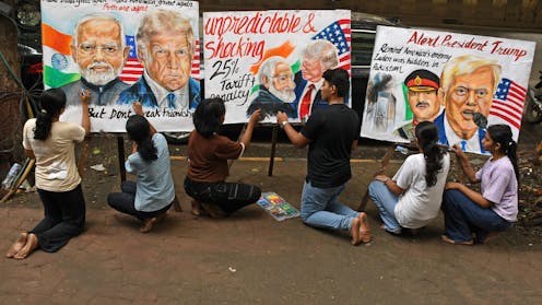
Students from an art school in Mumbai, India, created posters in response to Trump’s latest tariff announcement. SOPA Images/Getty

Last week, US President Donald Trump issued an executive order updating the “reciprocal” tariff rates that had been paused since April.

Nearly all US trading partners are now staring down tariffs of between 10% and 50%.

After a range of baseline and sector-specific tariffs came into effect earlier this year, many economists had predicted economic chaos. So far, the inflationary impact has been less than many predicted.

However, there are worrying signs that could all soon change, as economic pain flows through to the US consumer.

Decoding the deals

Trump’s latest adjustments weren’t random acts of economic warfare. They revealed a hierarchy, and a pattern has emerged.

Countries running goods trade deficits with the US (that is, buying more than they sell to the US), which also have security relationships with the US, get 10%. This includes Australia.

Japan and South Korea, which both have security relationships with the US, were hit with 15% tariffs, likely due to their large trade surpluses with the US.

But the rest of Asia? That’s where Trump is really turning the screws. Asian nations now face average tariffs of 22.1%.

Countries that negotiated with Trump, such as Thailand, Malaysia, Indonesia, Pakistan and the Philippines, all got 19%, the “discount rate” for Asian countries willing to make concessions.

India faces a 25% rate, plus potential penalties for trading with Russia.

Is Trump winning the trade war?

In the current trade war, it is unsurprising that despite threats to do so, no countries have actually imposed retaliatory tariffs on US products, with the exception of China and Canada. Doing so would drive up their consumer prices, reduce economic activity, and invite Trump to escalate, possibly limiting access to the lucrative US market.

Instead, nations that negotiated “deals” with the Trump administration have essentially accepted elevated reciprocal tariff rates to maintain a measure of access to the US market.

For many of these countries, this was despite making major concessions, such
as dropping their own tariffs on US exports, promising to reform certain domestic regulations, and purchasing various US goods.

Protests over the weekend, including in India and South Korea, suggested many of these tariff negotiations were not popular.

Even the European Union has struck a deal accepting US tariff rates that once would have seemed unthinkable – 15%. Trump’s confusing Russia-Ukraine war strategy has worried European leaders. Rather than risk US strategic withdrawal, they appear to have simply folded on tariffs.

Some deals are still pending. Notably, Taiwan, which received a higher reciprocal tariff (20%) than Japan and South Korea, claims it is still negotiating.

Through the narrow prism of deal making, it is hard not to escape the conclusion that Trump has gotten his way with everyone – except China and Canada. He has imposed elevated US tariffs on many countries, but also negotiated to secure increased export market access for US firms and promised purchases of planes, agriculture and energy.

Why economic chaos hasn’t arrived – yet

Imposing tariffs on goods coming into the US effectively creates a tax on US consumers and manufacturers. It drives up the prices of both finished goods (products) and intermediate goods (components) used in manufacturing.

Yet the Yale Budget Lab estimates the tariffs will cause consumer prices to rise by 1.8% this year.

This muted inflationary impact is likely a result of exports to the US being “front-loaded” before the tariffs took effect. Many US importers rushed to stockpile goods in the country ahead of the deadline.

It may also reflect some companies choosing to “eat the tariffs” by not passing the full cost to their customers, hoping they can ride things out until Trump “chickens out” and the tariffs are removed or reduced.

A US flag seen flying with the port of Los Angeles in the background
Earlier this year, many companies raced to bring inventory to the US before tariffs were imposed.
Robyn Beck/AFP/Getty

Who really pays

Despite Trump’s repeated claims that tariffs are a tax paid by foreign countries, research consistently shows that US companies and consumers bear the tariff burden.

Already this year, General Motors reported that tariffs cost it US$1.1 billion (about A$1.7 billion) in the second quarter of 2025.

A new 50% tariff on semi-finished copper products took effect on August 1. That announcement in July sent copper prices soaring by 13% in a single day. This affects everything from electrical wiring to plumbing, with costs ultimately passed to US consumers.

The average US tariff rate now sits at 18.3%, the highest level since 1934. This represents a staggering increase from just 2.4% when Trump took office in January.

This trade-weighted average means that, on typical imported goods, Americans will pay nearly one-fifth more in taxes.

Alarm bells

The US Federal Reserve is concerned about these potential price impacts, and last week opted to maintain interest rates at their current levels, despite Trump’s pressure on Chairman Jerome Powell.

And on August 1, economic data released in the US showed significant slowing in job creation, some worrying signs in economic growth, and early signs of business investment paralysis due to the economic uncertainty unleashed by Trump’s ever-changing tariff rates.

Trump responded to the report by firing the US Bureau of Labour Statistics commissioner, a shock move that led to widespread concerns official US data could soon become politicised.

But the worst economic impacts could still be yet to come. The domestic consequences of Trump’s tariff policies are likely to amount to a massive economic own goal.

The Conversation

Nathan Howard Gray receives funding from the Department of Foreign Affairs and Trade.

Peter Draper does not work for, consult, own shares in or receive funding from any company or organisation that would benefit from this article, and has disclosed no relevant affiliations beyond their academic appointment.

– ref. It might seem like Trump is winning his trade war. But the US could soon be in a world of pain – https://theconversation.com/it-might-seem-like-trump-is-winning-his-trade-war-but-the-us-could-soon-be-in-a-world-of-pain-262434

World’s biggest coral survey confirms sharp decline in Great Barrier Reef after heatwave

Source: The Conversation – Global Perspectives – By Daniela Ceccarelli, Reef Fish Ecologist, Australian Institute of Marine Science

Official analysis of 124 reefs on the Great Barrier Reef shows coral cover has dropped sharply after a record-breaking marine heatwave in 2024, prompting grave fears over the trajectory of the natural wonder.

Over the past few years, fast-growing corals had pushed the Great Barrier Reef’s coral cover to record highs. But those corals were known to be extremely vulnerable and one bad summer away from losing those gains.

Our new report by the Australian Institute of Marine Science (AIMS) shows these fears have been realised. The percentage of living hard coral covering the Great Barrier Reef’s surface dropped in each region we surveyed.

The recent extreme highs and lows in coral cover are a troubling phenomenon. It raises the prospect that the Great Barrier Reef may reach a point from which it cannot recover.

Another global marine heatwave

In healthy corals, tiny algae produce both the coral’s main food source and its vibrant colours. When the water gets too warm, the algae are expelled and the coral’s tissue becomes transparent – revealing the white limestone skeleton beneath. This is called coral bleaching.

Coral can recover if temperatures are reduced and the relationship with the algae is restored, but it’s a stressful and difficult process. And if recovery takes too long, the coral will die.

In June 2023, a marine heatwave bleached coral reefs from the Caribbean to the Indian and Pacific Oceans.

It reached Australia’s east coast in February 2024, causing extensive coral bleaching. Aerial surveys showed three quarters of 1,080 reefs assessed had some bleaching. On 40% of these reefs, more than half the corals were white.

In the aftermath, in-water surveys measured how much coral died in the northern, central and southern Great Barrier Reef. The worst damage lined up with the highest levels of heat stress.

Sharp declines in coral cover

AIMS has surveyed reefs of the Great Barrier Reef each year since 1986, in a project known as the Long-Term Monitoring Program. It is the most extensive record of coral status on any reef ecosystem in the world.

One component of the surveys involves towing an expert observer behind a boat around the full perimeter of each reef. The observer records the amount of live, bleached and dead coral. These observations are then averaged for each location, and for each of the three regions of the Great Barrier Reef.

After each monitoring season we report on the percentage of living hard coral covering the Great Barrier Reef’s surface. It’s a coarse but robust, reliable indicator of the state of the Great Barrier Reef.

Coral losses this year were not uniform across the Great Barrier Reef. On the northern Great Barrier Reef, from Cape York to Cooktown, average coral cover dropped by about a quarter between 2024 and 2025 (from 39.8% to 30%). The largest declines on individual reefs (up to 70% loss) occurred near Lizard Island.

Reefs with stable or increasing coral cover were mostly found in the central region, from Cooktown to Proserpine. However, there was still a region-wide decline of 14% (from 33.2% to 28.6%), and reefs near Cairns lost between 17-60% of their 2024 coral cover.

In the southern reef (Proserpine to Gladstone) coral cover declined by almost a third. In the summer of 2024, southern reefs experienced the highest levels of heat stress ever recorded, resulting in substantial coral loss (from 38.9% to 26.9%).

The declines in the north and south were the largest in a single year since monitoring began 39 years ago.

Despite these losses, the Great Barrier Reef still has more coral than many other reefs worldwide, and remains a major tourist attraction. It’s possible to find areas that still look good in an ecosystem this huge, but that doesn’t mean the large-scale average hasn’t dropped.

More frequent bleaching events

Mass coral bleaching is becoming more frequent as the world warms.

Before the 1990s, mass bleaching was extremely rare. That changed in 1998 with the first major event, followed by another in 2002.

Back-to-back bleaching events occurred for the first time in 2016 and 2017. Since then, bleaching has struck the Great Barrier Reef in 2020, 2022, 2024, and again this year. The impacts of this year’s bleaching event will be revealed following the next round of surveys.

The time between these events is shrinking, giving corals less time to recover. Cyclones and crown-of-thorns starfish are also continuing to cause widespread coral loss.

You’ll see in the following charts how the percentage of coral cover has changed over time. The vertical yellow lines show the mass coral bleaching events increasing in frequency.

Confronting questions

The coral reefs of the future are unlikely to look like those of the past. The loss of biodiversity seems inevitable.

But will the reefs of the future still sustain the half a billion people that depend on them for food and income? Will they continue to protect coastlines from increasing storm activity and rising sea levels? These are confronting questions.

Effective management and research into reef adaptation and recovery interventions may bridge the gap until meaningful climate action is achieved. But above all, the key to securing a future for coral reefs is reducing greenhouse gas emissions.

The Conversation

Daniela Ceccarelli works for the Australian Institute of Marine Science, a publicly funded research organisation that receives funding from the Australian government, state government departments, foundations and private industry.

David Wachenfeld works for the Australian Institute of Marine Science, a publicly funded research organisation that receives funding from the Australian government, state government departments, foundations and private industry.

Mike Emslie works for the Australian Institute of Marine Science, a publicly funded research organisation that receives funding from the Australian government, state government departments, foundations and private industry.

– ref. World’s biggest coral survey confirms sharp decline in Great Barrier Reef after heatwave – https://theconversation.com/worlds-biggest-coral-survey-confirms-sharp-decline-in-great-barrier-reef-after-heatwave-260563